Charlotte E Animation
Final Major Project
Preparing My Book
Now I am working on my final piece, I want to make sure the choices I make when designing my art book are as informed as possible. To do this, before I start working on the book itself, I want to look into some different examples of books that have

been adapted from other media. I looked through the books in my house and I have picked out three different examples: 'The Art of Horizon Zero Dawn' from the limited edition boxset of the game, 'Marcy's Journal' based off of the animated series Amphibia, and 'The Mighty Nein Origins - Jester Lavorre' which is based off of Critical Role's the Mighty Nein. Each of these books are inspired by an existing piece of media but all serve different purposes, so here I want to look into what makes them effective and how that could inform my book. These books all have a mixture of visuals and text so I know that when working on my book I need to find a balance of art, information and story.
The Art of Horizon Zero Dawn
This book primarily focuses on the concept art and visual development of the game. The art focuses on character designs, outfit concepts, the visuals for the different groups in the game, weapons, environments and full illustrated pages. There is limited text other than small subtitles explaining the contents of the images and the pages remain mostly focused on the art due to the simple plain backgrounds and wide spread. I really like the pages where you can see an entire rendered scene across a double page spread as they break up each section of development art and mark the theme for the next pages, as well as the fact you get to see all the ideas from the development in their final state. I actually looked at this book for my visual research into the Horizon series previously, so when I was thinking about making an artbook, this was the base idea I had in mind. While I like the fact that the focus is on the artwork, I think for my book I want to be able to explain to the audience what is going on in it, especially considering I do not have an actual game for them to play and just the concept. I definitely want to incorporate pages that are just focused on the drawings and development though, so I want to be able to find a good balance of how many pages should be explanation and how many should be visuals only. Since this is adapted from a video game and the other books are not, I also need to make sure my book conveys the original medium it is based off of.


Marcy's Journal - A Guide to Amphibia


Amphibia is a Disney animated series created by Matt Braly that follows three teenage girls who are magically transported to another world filled with frog people. The show mainly focuses on the story of the protagonist Anne, but this book tells the story of one of the other girls - Marcy - through the perspective of a journal she writes in. This book doesn't show any concept art or visuals that were actually in the show, but the drawings that are there are meant to be sketches made by Marcy depicting all the things she has seen and done. I found this format interesting as the book works alongside the show for any fans who are interested in exploring the story in more depth. I also like how the pages are printed to have more details like the sticky notes and taped in ciphers, it adds more personality and storytelling to the book and conveys some of Marcy's character you don't fully get to see in the show. While I don't want to write a whole book like this, I did think about how in the game, Hanna keeps a journal and you also find out about some of Ara's old plans through notes, so it could be interesting to maybe include some of these notes in the book, so the reader could feel as if they are seeing them themselves in real life. I like how the story of the show is covered in the book and depicting it from the characters perspective, allowing you to see what they're thinking that might not be explicitly said in game dialogue is a cool way to do it. Looking at these books so far, I know I want to have pages of art with some explanations, as well as pages that explain the narrative in a fun way.
The Mighty Nein Origins - Jester Lavorre
The Mighty Nein Origins is a series of comic books based off of the main characters in the Critical Role Dungeons and Dragons actual-play by the same name. Each comic follows one of the player characters and their backstory before they arrived at the beginning of the campaign's story. I have read most of the comics from this series, but my favourite is Jester's as I love the art style used in it and the way the designs are changed from the original actual-play series. The original Critical Role shows have had many adaptations, most recently the story of the Mighty Nein into an animated series, so the stories are often changing and taking on new forms. I find this approach interesting as in a similar way to Marcy's Journal, the books and show allow for new and old fans to explore aspects of the story that were only spoken about or never actually mentioned outright in the original. I think before the animated series, using comics was a really good approach to show this as you get to see the story visually, which you aren't able to in the original as actual-play is so verbal. While I don't want to go the comic approach for my book, I am mostly inspired by the fact they show the development of the designs at the end with written reasonings for each design choice. I would imagine an audience member who is reading my book would be someone who is engaged in art and the choices behind their favourite media's designs, so including a section like this feels important. I really like how you get to see some of the story you never see in the show, but for the case of my game and the time restrictions I have on this project, I don't think I will be able to do that. Although, this does give me some ideas to about finding a way to depict some key narrative points outside of my treatment sheet if I have time once I am done making my book.


After this research, I know that I want to make my book a mix of an artbook, game guide and exploration of the narrative. To do this, I am going to need a plan for my book and how many pages it will have, as well as how I am going to have the book physically made. I decided to ask one of my classmates Emmy, who made an artbook last year, how she got hers printed and she used the app bookwrite through the website blurb. I spent about 30 minutes testing the app and its features, and I am pretty set on using it for my book as it can print high quality images and is entirely customisable which will be perfect for what I do. The only issue is the colours seem to be a bit off at times so I will need to find a way to make sure all my colours match. My next step is planning out my pages in the book and what additional designs I will need to make. For this, I have made two separate lists, one where I list the total amount of pages that need formatting, and another where I list all the artwork I need to make to fill out those pages. I plan to use a lot of the drawings I have already made, but they will need formatting onto the pages. Here are the lists so far:
Total Book Pages:
-
Front / back cover wrap
-
Inside cover
-
Contents page
-
Game explanation double page spread
-
Introduce Hanna double page spread
-
The Grove illustrated page
-
Introduce Esme and Yvonne double page spread
-
Hanna journal entry #1
-
The City illustrated page
-
Enemies and animals double page spread
-
Introducing Harlowe double page spread
-
Meeting her illustrated page
-
Hanna journal entry #2
-
Introducing game design double page spread
-
Items double page spread
-
Weapons double page spread
-
Hanna journal entry #3
-
Looking at the stars illustrated page
-
Explain the end / boss
-
Thankyou for reading with star background double page spread
-
Any development sketches if space needs to be filled
Additional Drawings and Work:
-
Cover design
-
Inside cover design
-
Secondary font choice
-
Hanna journal entries
-
Meeting Harlowe illustration
-
Looking at the stars illustration
-
Page writing
The plan here is to break up and title sections with fully illustrated pages, for which I will use some of my pre-existing environment designs and two new ones. I also need to design some parts for the pages so they look more interesting than just a blank background. My plan for this week, is to complete all of these additional drawings, so I can format everything at once when they are done so I don't have to keep jumping between drawing tasks.
Book Designs
Front and Inside Cover Designs


The first pages I wanted to work on were the front and inside covers, as these pages establish the overall feel of the book for the audience, as it will be the first pages they see. I wanted to showcase the games protagonist and main motifs in the front cover design, so the first sketch I worked on was one of Hanna looking at the camera with a star over her face and plants growing around her to show both of these points, but after adding colour I wasn't liking her expression and after some tweaks I still couldn't find one that felt right. So I pivoted to having no face in the picture, but focusing on her arm instead, by starting with a sketch of hands holding up a star. I didn't like that first angle but made it instead so the whole star was shown with arms around the side. I started with the more asymmetrical hand shape, but found the balance was off with the star once I added colour, so I moves the plant hand down but still kept the two different hand poses. I added more chromatic aberration and shadows to the text to make the parts that overlayed with the star be able to stand out against it and then ported it over to bookwright. I reused the star graphic for the blurb and wrote it as followed:
'On a journey to save their home from the growing threat of destruction, the members of Allura must explore the enticing and overgrown post-apocalyptic landscape of their neighbouring city. Many monsters await them there, but the fractures in their friendship might be the thing that breaks them most.
This book explores my game concept created for my Final Major Project about renewal. The story explores growth, rebirth and the ups and downs of female friendship. Inside you can see my creative process and artwork I created for this project!'
I may still change this as I write the book's contents but am happy for now. I did have one issue formatting this, as the Nocturne Stars font doesn't actually have a comma design, so it just looked like a full stop. So I had to pick another font with a similar style to make the commas match, for which I chose the font Droid Serif that was within the bookwright app already.
For the inside cover, I wanted to make it brighter than the outside one to show the multiple sides of the game's designs, but it needed to stay simple. So I chose a vibrant green background with white text and used a textured brush to add a paper look with a darker green. I wanted it to be varied but not looking busy. I also decided to add a contact list with my personal website - that contains links to both this project and all my other work - and my business email address. I thought this would be helpful for anyone who comes to see my work at the end of year show if they wanted to reach me in any way after looking at the book. While I used a different font for some of my writing, I now need to pick another one for the main writing in my book that is accessible and readable while also matching the rest of my work.
Secondary Font Choice

Here I picked fonts that I liked and thought matched the Nocturne Stars font. I am more drawn to the slightly more detailed fonts, but don't want to overdo it as it still needs to be readable for the audience. My favourite from these is Crimson Text as it is rounder and more readable for me, but still has the more detailed look. I will use this for any big chunks of text in the book. Next I am going to work on the other full illustrations I need for the book.
Double Page Illustrations


I wanted this piece to focus on Harlowe and rebirth and renewal as it occurs in the book just after these concepts are mainly introduced. I decided to draw a portrait of her laying in the grass, as if she has just woken up when the group meets her. I chose to make half of it lit and half in shadow to vary the shades as there is so much green, but also to show a split between two sides of herself and her growth. I did plan on making the grass grow over her partially, but since it is all so green it ended up not being very readable when I added grass on top of her hair for example. I gave her a shocked and slightly scared expression but also didn't want to exaggerate it too much so that she was comically surprised. I really enjoyed making this one, portraits are probably my favourite thing to draw, but I want the next drawing to focus more on environment.


For the final double page spread, I knew it would be in the part of the book where I talk about the ending and group dynamics, so I decided to focus on half of the group looking at the stars. I realised I didn't really account for the books spine in the last piece, so made sure this one had the characters on one and star in the other so they would remain clear. I kept the shape of my star item design but showed it in the shooting star form with a few others off in the distance. This is the most simple drawing I have done for the double page spreads, but I enjoyed adding all the effects and layer modes to the stars in the sky. Additionally, I wanted to try a new way of making a reference for this drawing, so I made a digital collage of different photos to plan out the poses for the two characters and how much of them would be seen.
All of the additional drawings I need are done now, so my plan when I return back to college and start next week is to begin working on the contents of the book and its layout.
Book Draft
Before I make any designs for pages with writing, I wanted to write the first draft for my book, which can be read in the PDF linked. I decided to write three journal entries and went more in depth into some of the game design elements than I have in previous writing, but I reused a lot of my writing from my game design document and treatment sheet. I also decided while writing that I wanted some sort of drawing on the page about the ending and final fight, but I didn't want to make a human looking design for Ara as the whole point of her is that she is no longer human due to her greed and rebirth. So my plan for this drawing is to make a small piece of what it might look like when the initial star explosion happened to use on one side of the double page, which I will work on next. My last change for now is that I may use the drawing of the star on the book cover for the second star item instead of the one I drew before to keep some more continuity across the design, as most of the stars I have done have been pretty random.
Draft 1
Final Draft
Before just using this writing as my final draft, I wanted to receive some feedback to see what else I could add or change. I decided to ask two others to read it over and I also went through and checked any grammar issues. My main feedback was in order to have the words and concepts I created for the story be read correctly, I needed to italicize or quote them to make the distinction clear. I went through and did this for any of the locations and concepts like The Growth, which changed to The Growth. With my grammar check, I went in and rewrote some of the sentences to flow more smoothly and also cut out and redid some of the parts of the journal pages so they sounded more natural.
Final Book Drawings
As I said, I wanted one more drawing done for the page about the ending of my game. I decided to draw an outline of a feminine figure in the same shape star on the cover, except I changed the interior effects. I made it so that the brightness of the star wasn't its own star shape, but a gradient that goes into the coloured edges. My plan is to display this on a dark background to make clearer contrast and make it seem as bright as possible. I was also thinking about what the backgrounds for my contents and thank you pages would be, but realised when I looked at the total amount of double page drawings that I have done, I didn't account for the original star drawing and the cat o the road, so my plan is to use that for those.

Now I have all of the written content I need for my book planned out, I am going to start to format the book in blurb to make sure it is readable and visually interesting to complete this final piece.
Book Formatting
I started formatting my book by first inserting all the pages that contain the double page illustrated spreads, then I moved onto working in chronological order. As I began working on the pages though, I started feeling that the journal pages felt out of place compared to the design of the rest of the book. I put the text in and started setting them up, but they just felt awkwardly placed in there. So in the end, I decided to cut these pages out, but since they - the final one especially - had information about the plot and the ending, I opted to add a few more sentences to the end page about the final reveals and narrative.
While working on the pages I kept, the first issue I had was the pages feeling empty in places. On the character pages, I decided to add colour palettes to fill them up and indicate more of my designing thought process. Then, on some of the other pages, I used my drawings of the animals and the star on the cover to fill gaps between paragraphs. I then had the opposite problem when making the page about Yvonne and Esme, since there was too much writing that I couldn't make fit when I had them both on the same spread, so in the end I chose to give them a double page each with all the text on one side, and their designs on the other. On Esme's page, I had one extra gap to fill though, so I quickly drew a black bag with embroidery that she would have as an item design. Speaking of item designs, I laid them out in a way that made the space feel too empty with only four designs, so I drew one more design of a 'mysterious elixir' that works as a random effect potion that you can gamble with in battle.


Once I reached the last pages, I knew that I wanted to make the page about the ending have the star drawing on a dark background, but just that ended up looking too plain and boring on the text side. To fix this, I repurposed the stars from the stargazing double page illustration to make a space textured background that goes from lighter to darker the further away from the star you are. On the final thank you page, I used the drawing of the star vines that I made for the game screens as the backdrop, then for the contents page, I used the drawing of the cat in the distance that just had a few trees erased to make a clearer background for text on top.

I will display all of the pages in the next section, but before exporting, I made a pdf proof of the book using Bookwright's feature and was initially worried as everything looked very pixelated. It took me a moment to realise, but the quality was only reduced because the app makes the proof a worse quality so you wont print it yourself and only through their service. Once I double checked the settings quality in the app and their internal preview, I adjusted a few image sizes but was now happy with the overall quality. Before I sent it to print though, I wanted some feedback from my peers. I asked two of my classmates and someone outside of college to review the book and I received mostly positive feedback. The main thing to change was that some of the background colours would have been better on other pages due to the colour of my drawings on top, so I swapped a few of the palettes between pages. The rest of the feedback was that their was a good balance between text and images so it didn't look too overwhelming and that the double page illustrated spreads were a nice touch, so I am overall ready to send it off. After reading it over a few more times to check for any spelling errors, I have now ordered the print. In the next section, you can see what the final book looks like digitally and the cover print.
Final Piece:
ALLURA Official Artbook and Guide


The physical copy of my book arrived about a week after I finished and ordered it. Overall, I am very happy with the outcome of the book and the printing quality. Despite the warnings on the app, all the drawings came out in high quality, the colours look accurate and nothing got cut out while printing and trimming. As I thought they might, some of the double pages came out a bit weird looking due to the seam, but that doesn't bother me too much. To display these pieces better at the end of year show, I plan on printing them out to put up on the wall around my area.
While I have finished my intended final piece, I still have five weeks left of the project until the due date, so I want to make a second final piece that is an animation of some kind. I want to do an animation as I haven't done any since last years FMP, and really want to improve on all of the problems I had with it last year. Firstly, I will need to research and conceptualise an idea, but I have a couple in mind as I have been thinking about it over the last week while making the book. My plan at the moment is to make a 2D frame by frame animation like last year, but make it shorter and more detailed, but I will see how this changes after some planning.
Animation Research
I want to start my animation work by reflecting on what I could improve from my animation last year. I have three main points that come to mind when thinking about what I could have done better: length, fluidity and lighting. Firstly, I think that if I had made my animation shorter, I might have been able to improve the look of the animation overall as I could have spent more time on each scene and its details, rather than stressing about getting the whole narrative conveyed. To work around this, I will make my animation shorter and I will only make it reflect a small portion of the overall narrative, as to not add up too many scenes. Next, I found that the final product looked quite stiff and unnatural in places. Since it was my first time animating properly in 2D, I think I struggled to understand where to add movement, but I want to focus more on that this time. I will tackle this by adding more subtle movement between frames that are meant to be still, as well as using references for scenes if I am struggling to plan the movement. Finally, while I had some interesting lighting effects last year, I really want to up it this time, especially considering all the bright and star motifs throughout the designs I have made so far and will potentially include in the final product. I want to focus on bright colours and fun lighting to make the animation more lively than last time.
Now I have reflected on what I want to improve, before I start working on my animation, I want to do some visual research on a couple of 2D animations I could take inspiration from. I am looking for ones that match the overall visuals of the art I have made so far, as well as ones that have bright and dreamy atmospheres as I want my animation to fill fluid and light.
ANJAIL!


'ANJAIL!' Is a multi-ending choose your own adventure animatic that follows Thomas, he is hit by a bus while riding his bike and dies, before being sent to work in purgatory in his afterlife. While this isn't fully animated, I find the style of this really beautiful with the vibrancy and loose lines. The bright colours match what I am picturing in the dream sequence and appearance of the natural backgrounds in my animation. The painterly style matches some of the concept designs that I have made so far, so if I go a similar direction, I can use the same techniques I already have. Again, while this is an animatic, I think keeping my animation low frame rate might help me manage my workload more effectively, as I want to include movement but also only have a few weeks to work on the project. The final thing I am drawn to from this pilot is the speed and quick pace between scenes, while also being easy to follow. Since one of my goals is to make a shorter animation than last year, a faster pace would be a good direction to take it. It doesn't do this in the animation, but while I am thinking of pace, ideas like jumping across to different periods of time while staying on a narrative theme come to mind.
Bee and PuppyCat


This show follows Bee, who lives a regular, boring life until she meets PuppyCat. Together, they travel through different realities doing temp jobs, known as 'Fishbowl Space'. I really like the softness and simpleness of this shows visuals. The overall dreamy, weird vibe and compositing is one of my favourite parts, as the atmosphere matches the general whimsical vibe of the show. The textured backgrounds and atmospheric lighting draw me in too, and as I mentioned wanting to add more compositing and lighting effects, this would be a good source of inspiration. Another thing I am drawn to are the space scenes. As stars and space are a big theme in my project, these scenes are helpful to look at as the backgrounds and unnatural movement really sell the effect. In the scene pictured, the way Bee's skin peels away is also a really interesting effect. Since I want my animation to be more fluid, including some unique effects and unnatural movements could make it feel more alive like I want. While I liked ANJAIL's painterly style, it and this show still have relatively simple linework and character designs to be more easily animated, I plan on doing the same. I only want to briefly look into animation here as I have done research into other animated shows earlier and have a good idea of what style I would like to do from this.
Animation Plan and Storyboards
Now I have done some research, I have two ideas for my animation. I want to put more focus into my theme of renewal for my animation, so I am choosing to focus on Harlowe, as she is the character in the group who goes through the most physical change, in the sense her body decays and is renewed across time. I want to focus on her transformation from human to The Growth, in one of these two ways:
-
Time Passing - Follows a still shot over time as years pass as Harlowe transitions from her old self, to death, to plant, to her in-game design. Seasons change, buildings fall and trees grow around her until she is woken up by other characters. This will be animated to a custom soundtrack that will mostly focus on sound effects and not music.
-
Transformation - In a similar way, we follow the Harlowe at the start when she dies. There is then a dreamlike sequence where her skin peels away from her skeleton and moss grows over it, creating her appearance as a plant, before she is awoken again by the others. This will be animated to the first 30 seconds of 'sense (is)' by Hemlocke Springs (linked below.)
I want to get animating as soon as possible, so for both ideas I don't want to put too much focus on sound design, so for the first I plan on making nature and environmental sound effects and the second will be to a preexisting song - 'sense (is)' by Hemlocke Springs - that matches what I imagine the animations story progression will be. In order to see what an audience would prefer, I have made a quick survey with the two options explained, a linked image of my character designs and a link to the song.

I sent the survey to my classmates for feedback. They all responded 10 times each for some reason, but the balance of choice would stay the same either way. Overall, 'Transformation' was preferred which I am happy with, as after mulling it over myself I thought this would be more interesting for me to make and add all the details I wanted to improve on. I next need to work on how I will adapt my more detailed design into one that is more animatable, while keeping the style I like.
Adapting Designs


Originally, I planned to quickly adapt these designs, but after doing quick sketches I decided that I would wait until I went in my animation program to fully decide, since I haven't picked a brush yet. I just sketched over the original designs and changed the outfits and made some details simpler. For her first design, I dropped the jacket and made less details in her hair, but this still might change when I start storyboarding. In the scene, I want her to look panicked and disorganised, so I made her expression more nervous. For her plant design, I cut down on the plant details and removed the clothes since she wont be seen at that point, but I didn't just want to make her just naked, so I added more patches of moss. These designs look kind of messy with the linework, which I don't mind too much but I want to clean them up a bit in my storyboards. I am considering this more of a warm up design than anything else since it was more just a quick sketch and colour, but it was still helpful to decide what details were necessary or not.
I could detail this more, but I honestly just want to get into storyboarding so I can start the animation, so I am going to leave it for now. My plan is to make my storyboards on flashcards, then align them with the music in an editing app to use as a proof of concept, then I will setup my animation program and add them to it.
Storyboarding
Before storyboarding, I wanted to make a list explaining all of my shots and where they align compared to the audio, so that I don't get lost when drawing the scenes. I originally intended to have three scenes, but split it into five even though some are in the same environment. This also includes the credits though so it is only really four to animate. Here is the plan I made:
SCENE 1 - 00.00 - 00.14
-
Fade in from black
-
Harlowe up close shot looking around
-
Zoom out to see her whole body ducked behind a wall
-
Close up on her face, breathing heavily and frantic
-
Light begins to spill in from behind her
-
See her look around the ruin and squint at it and the scene is filled with white light (violin transition)
SCENE 2 - 00.15 - 00.23
-
Close up of her eyes closed in a starry swirling background
-
Shows her whole body falling through space
-
Comes in at a side angle and her skin begins peeling away to reveal a skull
-
Comes back to the whole body shot with the last bits of skin peeling away, showing just the skeleton, (bare just as bass is about to begin)
SCENE 3 - 00.24 - 00.30
-
Same shot, moss starts coming in from the point of her heart.
-
Up close shot of the side of her face with the moss growing over, revealing her new face
-
Up close shot of her face front on, as her final hair spreads on her face and eyes open in the stars (just as singing starts)
SCENE 4 - 00.31 - 00.32
-
Her eyes open in the same shot on a grassy outcropping with warm lights
-
She pulls a shocked expression, quick cut away
SCENE 5 - 00.32+ (FADEOUT)
-
Title Flash
-
Credits Sequence
Now I have this, I am going to base a storyboard off of each of these bullet points and edit them to the pace of the music.
I created my storyboards on white flashcards and matched them to the scenes I planned out, although I changed a few of the shots in the star void scenes (two and three). I then took them into krita, where I have decided I will animate as I have experience using it. In krita, I aligned each scene with where I want them to change in time with the music. I realised while I was doing this that I probably would benefit from adding some transitional scenes where she is half covered in skin or moss, but by the time I was editing it I was pretty over storyboarding and have decided that I will just deal with that when I get to it. At the end I left a long gap on the same shot, but this is where I plan to
add the end credit sequence and I am yet to decide if I will cut away from that shot or add text on top of it while it goes through a looping animation. I am going to use the same krita file for my main animation, so I can constantly have these storyboards as reference. I also set this animation up at 8fps, as I find it is a good middle ground between low frame and high frame rate, so I can combine both atmospheres I liked from my research.
Animation Pitch


Before animating, I decided to pitch my idea to some of my class. I ended up doing this online where I streamed my slideshow to them, as its getting to the end of FMP for them as well and lots of them are working at home where they have access to their animation tools. Unfortunately, I was having issues with my computer and was unable to record my pitch, but I have the slides and they contain all the information I went over. I explained the information on my slides and my overall concept, then showed them the storyboards I had made. They agreed with me that I could have added more transitional frames, but other than that they didn't have any other feedback. I am happy to go ahead with animating now I have done all of these things.
Animating
To start my animation, I have my storyboards that are aligned with the music, but I have decided that I want to lower my frame rate to 6fps, as I am a bit worried about the time I have left and how long it will take me to draw some of the more complex frames that have bones and skin peeling away. This means I have to re sync the storyboards, but other than that I can just get started. This week I have been a bit too busy to actually start the animation, but the page is fully ready for me to start my sketch next week.
I have started working on my animation from my base storyboard keyframes and this week have done up to storyboard 2.1. Initially, I struggled drawing as my lines felt scratchy and uneven, but I realised it was because my graphics tablet had its pressure sensitivity turned off at some point, but I was able to fix that pretty easily. I am bearing in mind this is just a sketch so far, so lots of the frames are still a bit uneven, but I want to focus on finishing this sketch as soon as possible rather than anything else. I have been happy with my progress up until it came to scene 2.1, where her skin is meant to peel into space and reveal the skull. I tried a few iterations of this, but found trying to find a way to animate it was frustrating me more than it was worth, so I have instead decided to pivot. Instead of there being any skeleton parts, I am going to change the animation so that the moss grows directly on Harlowe, and I am going to extended some of the shots in space to avoid changing the camera angle as much, as I don't really need to now that the skeleton wont be involved. It disheartened me a bit that I can't find a way to match my vision, but I know it serves me better overall to just keep it moving rather than being stuck at one part. I am happy with the rest of my progress, and want to finish the sketch by the middle to end of next week so that I can do the linework and colour as quickly as possible.
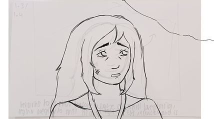

I have now completed the sketch for my full animation. The sketch has all of the movement except some line boil in places and the movement in the space backgrounds. Since I cut out the skull scene, I made it so the moss grows directly on top of her skin in two shots, one of her face and one of her outstretched arm, before going back to the full body angle with her fully covered in moss. I am glad I pivoted my idea since I got to put more focus on the plant growing plants, which still shows renewal from her old self rather than renewal from her old self, to death, to plant. My next step will be working on the line art for the character only, as I want to make my backgrounds a bit painted. My plan is to add the line art and a base colour on her to make her stand out against the backgrounds, then add her full colour once the backgrounds are in.


For the line art, I decided to use the same pencil brush I used for the sketch, but at 5 pixels instead of 7. I am just lining over my preexisting sketches, while incorporating some of the notes I wrote for myself while sketching, like adding more movement to a certain frame. I said before I would add a base colour to the character as I lined, but I have just decided to add the colour when I do the backgrounds so I can make sure they have the right feel and atmosphere. At this point I have lined about 2/3 of the sketch, and want to finish it by Monday next week.


My line art is now completed for all the animated scenes - so everything aside from the end credits and the title card. I added some extra animation like moving the lanyard, adding more line boil and a few extra flower details. For now I am just keeping the lines black, but I may go in and edit them when I add colour if there are more suitable ones. I did notice that I had accidentally made some of the lines a grayish colour rather than black, so I went in and just alpha locked those frames and drew over in black. I am now going to move onto adding colour, but I have changed my plant to adding in the character colour for every scene, then add the backgrounds and match those base colours to them.
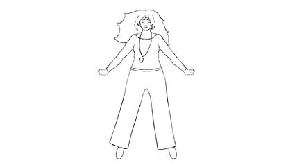


I have now added the base character colour that I picked from my references to the animation. I first worked on the first and last scenes when adding colour and effects, since I wasn't 100% certain on what I wanted to make the background look like in the transformation sequences. Unfortunately, I forgot to take screenshots before I added effects to the base character and merged my layers, but here is how I coloured these two scenes overall. I decided to make the final scene more yellow toned - like a scene at sunset, compared to my concept art for this shot, but I like this more as it feels more airy. I made the first scene very dark and gloomy to match her fearful expression and added lots of dark overlay lighting and a rim on the side that faces the light. I have completed the middle scenes' base colour, but wanted to do this first so I had more time to think about that background.


For the transformation scenes, I knew I wanted a background that moved in some way to reflect how she is falling through space. After testing some ideas where the colours moved or where it was a whole starry scene, I decided to make this hue shift loop. I was inspired by my animation research when making the background, especially the vibrancy and loose lines of ANJAIL!. I wanted a specific brush texture for this, so I went to use procreate on my iPad to make the design, then created each frame by hue shifting 2%. I had to make my own gradient when going from the last shift back to the start, as while changing the frame each time the image had lest distinction between colours, but I fixed this by lowering the opacity and combining frames to create a gradient between the first and last. Then, I imported these frames into my Krita file and had them loop through the transformation scene. I really like this background as it reminds me of the chromatic aberration and colours of the star, so I also decided to lightly overlay it on the first scene to further sell the incoming apocalypse from it. I decided to add a few more effects to this scene, like a fade to white and her eye filling up with the shape of the stars. I also overlayed the background onto her and erased the middle so it looked like a colourful rim around her as the light is behind.


With all this done, I just added some cleanup on a top layer in places where colours bled or it looked a bit messy, then rendered it as a video through Krita. This really dragged the quality down though, so I decided to use blenders video editor and imported each of my frames as PNG images, then exported it at the highest quality. This still ended up a bit crunchy looking unfortunately, especially in the first scene, but I can't really think of another solution and its not bad enough for me to not just upload it, so I have just gone ahead. I only noticed after a bit of colour clipping in the first scene, but I have just decided to leave it as it isn't all too noticeable.
Final Piece:
Renewal Animation
Here I have my final completed animation. I wanted to get some feedback on it so I made a quick survey and sent it to my classmates. It had the following questions:
-
Do you think this animation conveys the themes of renewal, growth and decay?
-
What did you interpret the plot to be?
-
What did you think of the music choice?
-
What do you think went well in the animation?
-
What could i improve on?
Since I want most of my focus in this piece to be on my theme, that is the most important question to me. After leaving it for a day, I received 5 responses, and although that's not that many, I need to move on from this step. In response to the first question, everyone said that it does convey those themes, so I am very happy with that. For the plot, most people interpreted it to be that a disaster or otherworldly threat was incoming, and she had been chosen or affected by it to turn into nature. I am happy with these responses as I thought the animation might be a bit too abstract, but the overall arc and themes have been conveyed, even if not all the details are there. In regards to the music choice, all the responders said that it fits, for reasons such as it being unique, a balance of intrigue and power and it feels strange and mysterious. Again, I am happy with these responses as those are some of the moods I wanted to convey with the transformation especially. With what went well, most liked the colours and transformation sequences, which I agree was my strongest area. For improvements, the two that were mentioned by all responders were to extended the establishing scene and explore the environments more. I agree with these points as I think that start section is the weakest scene in the animation. If I added an extra shot before, where maybe she is running through the chaos of the apocalypse before crouching down behind the rock, her fear and despair could have more context.
Overall, I am happy with this outcome and think I did improve on the points I wanted to when reflecting on my work last year. I made it shorter, added more movement - even if it wasn't that complex - and added interesting lighting with the shifting rainbow background.
Final Evaluation
For this project, my brief was to create a project surrounding a theme of my choosing. I chose the theme of renewal, with a focus on growth and decay. I was drawn to this theme as it felt broad but not overly so, it combined other themes I liked such as nature, time and humanity and I had some research source ideas early on. Making an in depth project proposal allowed me to narrow down my initial focus and see where I needed to improve from last year. In my project proposal, I explained how I wanted to research decay and renewal in media, apocalypse themes and natural environments with both primary and secondary sources. My initial primary research with my theme survey was a helpful first step as I could see what audiences were interested in and what concepts they agreed with that I had thought about in my initial research. This guided me to later research into the effects of environmental change, the apocalypse and future planning and what stories to look further into with apocalypse fiction. Branching out my research sources to more than just digital media really helped broaden my understanding of the topic and lead me to the themes of my final project. I found this especially when researching the different overgrown environments and how people prepare for the apocalypse - which brought me to making a post-apocalyptic overgrown world, with themes of science and space that reflect some real world issues. Through researching different mediums, I had to approach my research from a different angle, which let me find new concepts within my themes I hadn’t thought of covering in my initial research and project proposal. For example, while researching the Crane Wives and Annihilation, the themes of relationships and the issues I had with the book led me to making an all woman story. I also did a lot more primary research than in previous projects and I was especially inspired by the photos of models I took in the Tate and the differences in what nature looks like when overgrown and cut down. This research inspired my environment designs and the making of my model. My apocalypse media visual research inspired most of my digital designs, mainly lenadoodllles with my character designs and horizon and the last of us for my environments. On the whole, my research helped inform the narrative and designs of my final project, but looking back I do wish I had used my environment research more in my designs and made some more illustrations focused on overgrown landscapes as that was such a huge part of my research.
I began my designs with moodboards and initial sketches to help me come up with my concept, before moving on to selecting my game idea of ALLURA. I wanted to put more of a focus on game design with this project, as in my previous game design work, most of my feedback was that I was lacking there. Making my treatment sheet and game design document really helped me as I got to cover that area and it allowed me to get all of my ideas down in a clear way and make the concept feel like an actual game and not just a story. Even though I changed some of the narrative focus throughout the designing phase as I thought more about certain points, I found it better to keep my ideas open and changing than staying rigid and stuck in my first story draft. Writing in depth audience analysis also helped me with this, since it helped me decide to focus more on femininity, fantasy, sci-fi and exploration. I got to carry on my game design into my drawings, where I made title screens and items, and while this wasn’t my favourite part of designing, it helped me flesh out the characters and world more as well as the overall visual for the project with the logo. In my project proposal, I stated that I wanted to work primarily in digital 2D, but use some physical techniques like modelling and painting. I also explained that I wanted to change my workflow to do my initial designs with each piece of work, rather than all at the start. For my digital approach, I found making the ‘sketchbooks’ where I went from concept to final design to be really useful, and I plan on using this approach in my artwork going forward still. I did a lot of digital designs, but I still wanted them to be varied and I think I have done that successfully by making characters, enemies, environments, the book, animation and game design parts. I also think I was successful in using a variety of medium approaches, and although making my model, coins, prints and outfit didn’t necessarily contribute to my final designs, trying something different was very enjoyable and a good change of pace from drawing on a screen. Through this, I have found I really enjoy modelling with clay and I want to carry on trying new things with it after the project is over. I ran into a few issues with getting stuck on a design - like Harlowe’s character - or my initial plan not working - like the cat print - but I found pushing on and revisiting my initial design to be the best way to get over these issues, rather than keeping going in the same direction hoping it gets better.
For my final outcomes, I am most happy with my artbook. Getting to take all the designs I made throughout the project and getting them printed as an official book was very rewarding. I had some problems with the book program, especially with sizing, but I was able to put all my designs in the format that I wanted and the final outcome printed out very clearly. With my animation, I think I have improved from last year, but I still want to get better at animating. I couldn’t execute my initial storyboards with my current skill level and deadline restrictions, which disappointed me quite a lot. I was able to pivot and make a final outcome that I was happy with, but I still have a ways to go with my animation and want to keep practicing now that college is over. Throughout this project, I think I have made effective evaluations, especially with the daily action plans as I found those so helpful with staying on target. I had a few moments where I was stressed about deadlines, but I have been able to finish my project to a standard I am happy with in a good time. Overall, I really enjoyed this project as I felt very connected to the narrative I made. I got to try lots of different design approaches and got to research things I love and new concepts. I am happy with my final outcomes and would love to put some more time into this game idea in the future.
Research Log
Reference List:
Adventure Time, (2010). Cartoon Network.
Almerini, A. (2025). Lithium mining in the United States: where it stands today. [online] Solar Reviews. Available at: https://www.solarreviews.com/blog/lithium-mining-in-the-united-states.
Anderson, J. (2025). Decay and Rebirth in Art: A Visual Journey. [online] 1st-art-gallery.com. Available at: https://www.1st-art-gallery.com/de/article/from-ruins-to-renaissance-depictions-of-decay-and-rebirth-in-art/ [Accessed 15 Feb. 2026].
Apale, K. (2025). Paintings. [Oil] Available at: https://www.apale.art/paintings.
Badjaune (2026). ANJAIL! CHAPTER 1! [online] Youtu.be. Available at: https://youtu.be/Yzul-X92R9E?si=DQ0j-BWT-s5SNb2O [Accessed 20 Apr. 2026].
Bennett, H. (2020). Life finds a way: when nature reclaims abandoned places. [online] www.sciencefocus.com. Available at: https://www.sciencefocus.com/nature/life-finds-a-way-when-nature-reclaims-abandoned-places.
Braly, M. (2022). Disney Manga: Marcy’s Journal - A Guide to Amphibia. TOKYOPOP.
Buisness Insider (2018). Chernobyl Crow. businessinsider.com. Available at: https://i.insider.com/5cf0013e11e20556736f3bd4?width=800&format=jpeg&auto=webp.
Chagall, M. (1911). I and the Village.
CNET (2020). Inside the doomsday bunker for the super rich. [online] www.youtube.com. Available at: https://www.youtube.com/watch?v=TX1sRxCrduA [Accessed 3 Oct. 2021].
Coates, G. (2024). The Impact of War on Art: How Conflict Shapes Creativity and Culture. [online] Naturalist Gallery of Contemporary Art. Available at: https://naturalist.gallery/blogs/journal/the-impact-of-war-on-art-how-conflict-shapes-creativity-and-culture?srsltid=AfmBOor52rfnjVs3Eq-sjzqIwg6cLdzvJd5nHvGQtDHbI7nEFFu0WH5f [Accessed 8 Feb. 2026].
Darya Volkava and Riha, K. (2024). Growing old while staying young. EMBO Reports, 25(3), pp.934–938. doi:https://doi.org/10.1038/s44319-024-00062-4.
Daskalova, G. and Heyl, A. (2023). Nature is changing as land abandonment increases. [online] IIASA - International Institute for Applied Systems Analysis. Available at: https://iiasa.ac.at/news/may-2023/nature-is-changing-as-land-abandonment-increases.
Davies, P. (2017). The art of Horizon zero dawn. London: Titan Books.
Davis Baker, S. (2025a). Bunkers, Vaults & Biospheres. [online] YouTube. Available at: https://www.youtube.com/watch?v=fr5fQM-Vp1U&list=PLMUVbYHalv_FLU3Jd8c_STy6cVs7RcJPQ&index=1 [Accessed 18 Feb. 2026].
Davis Baker, S. (2025b). The Persistence of Decay. [online] YouTube. Available at: https://www.youtube.com/watch?v=Yqz3h6RF_7I&list=PLMUVbYHalv_FLU3Jd8c_STy6cVs7RcJPQ&index=2 [Accessed 25 Jan. 2026].
Faculty of Divinity, University of Cambridge (2021). What Is the apocalypse? [online] YouTube. Available at: https://www.youtube.com/watch?v=qffEGFOWYbQ.
Fonts, 1001 (2025). Nocture Stars Font. [online] 1001 Fonts. Available at: https://www.1001fonts.com/nocture-stars-font.html [Accessed 31 Mar. 2026].
Foraging Course Site. (2020). Rosebay Willowherb or Fireweed | UK Foraging. [online] Available at: https://www.foragingcoursecompany.co.uk/post/foraging-guide-rosebay-willowherb.
Friedrich, C.D. (1810). The Abbey in the Oakwood. [Painting].
Goh, K. (2020). Apocalypse Now: Why we can’t get enough of the end of the world. [online] www.theskinny.co.uk. Available at: https://www.theskinny.co.uk/intersections/features/apocalypse-now-why-we-can-t-get-enough-of-the-end-of-the-world.
Green, R. (2015). Rebecca Green Illustration. [online] Rebecca Green Illustration. Available at: https://www.myblankpaper.com/blog/2015/6/3/coyote-stories [Accessed 23 Feb. 2026].
Harlow, C. (2018). The Art Direction of ‘Horizon Zero Dawn’. [online] The Female Gaze. Available at: https://thefemalegaze.org/2018/11/14/the-art-direction-of-horizon-zero-dawn/.
Helmenstine, A.M. (2018). What We Know About the Chernobyl Animal Mutations. [online] ThoughtCo. Available at: https://www.thoughtco.com/chernobyl-animal-mutations-4155348.
Hill Baptista, M. (2025). Does Capitalism Pose a Bigger Threat or Helping Hand to the Environment and How? [online] Global Social Challenges. Available at: https://sites.manchester.ac.uk/global-social-challenges/2025/01/16/does-capitalism-pose-a-bigger-threat-or-helping-hand-to-the-environment-and-how/.
Horizon Zero Dawn . (2017). Sony Interactive Entertainment.
Jackson, L.E. and Koch, G.W. (1997). The Ecophysiology of Crops and Their Wild Relatives. Ecology in Agriculture, [online] pp.3–37. doi:https://doi.org/10.1016/b978-012378260-1/50002-6.
Kusama, Y. (2016). Yayoi Kusama: Infinity Mirrors. [online] High Museum of Art. Available at: https://high.org/exhibition/yayoi-kusama-infinity-mirrors/.
Leen, D. (2019). Environment Responsibility: Which Companies Help The Most. [online] GreenMagazine. Available at: https://azgreenmagazine.com/5-companies-that-help-save-the-environment/ [Accessed 5 Feb. 2026].
lenadoodllles (2026). gwend of the world. [online] www.webtoons.com. Available at: https://www.webtoons.com/en/canvas/gwend-of-the-world/let-down/viewer?title_no=1040944&episode_no=8 [Accessed 24 Feb. 2026].
Lord Of Culture (2026). The Apocalypse Fantasy Nobody Admits To. Youtu.be. Available at: https://youtu.be/RPeDKfQwqNc?si=0sVpR8FSJ7lMzXBQ [Accessed 18 Feb. 2026].
Maggs, S., Mercer, M., Bailey, L., Hunter Severn Bonyun, Le, C. and Maher, A. (2021). Critical Role : the Mighty Nein origins, Jester Lavorre. Milwaukie, Or: Dark Horse Books.
McLaughlin, K. (2023). See inside a ghost town of abandoned mansions in China. [online] CN Traveller. Available at: https://www.cntraveller.com/article/see-inside-a-ghost-town-of-abandoned-mansions-in-china [Accessed 30 Jan. 2026].
Medlock, K. (2015). An abandoned Chinese fishing village gets reclaimed by Nature. [online] Inhabitat - Green Design, Innovation, Architecture, Green Building | Green design & innovation for a better world. Available at: https://inhabitat.com/photographer-encounters-forgotten-chinese-city-covered-in-lush-vegetation/?__cf_chl_tk=G_zYbGckeE0gzC37QLVg_WyvN5uPMgomkqwKStkxoLk-1769795539-1.0.1.1-wfqEYiBHnbY4QoMXbjdyQ2oZfoCmE3rAwSrNpVFUsFU [Accessed 30 Jan. 2026].
Mendieta, A. (n.d.). |ENTER|. [online] ANA MENDIETA. Available at: https://www.anamendietaartist.com/work/67f45e26-9b6f-4358-92d8-01f3c4091410-xsyhr-lgr36/67f45e26-9b6f-4358-92d8-01f3c4091410-xsyhr-lgr36/67f45e26-9b6f-4358-92d8-01f3c4091410-xsyhr-lgr36.
NASA (1970). Space Colony Art from the 1970s. [online] The Public Domain Review. Available at: https://publicdomainreview.org/collection/space-colony-art-from-the-1970s/.
National Trust (n.d.). History of Orford Ness │ Suffolk. [online] National Trust. Available at: https://www.nationaltrust.org.uk/visit/suffolk/orford-ness-national-nature-reserve/history-of-orford-ness.
Nervous System (2015). An Animated Tribute to the Southern Reach Series. [Animation] n-e-r-v-o-u-s.com. Available at: https://n-e-r-v-o-u-s.com/blog/?p=6701.
Netflix (2022). Bee and PuppyCat. Bee and PuppyCat: Lazy in Space. All screenshots and promotional images for Bee and PuppyCat: Lazy in Space.
Nunez, K. (2021). Why Do We Age, and Can Anything Be Done to Stop or Slow it? [online] Healthline. Available at: https://www.healthline.com/health/why-do-we-age#summary.
Orfordness Lighthouse Trust (2020). Orfordness Lighthouse Trust - HOME. [online] Orfordnesslighthouse.co.uk. Available at: http://www.orfordnesslighthouse.co.uk/ [Accessed 30 Jan. 2026].
Princess Mononoke. (1997). Studio Ghibli.
Rappel, I. (2015). Capitalism and species extinction • International Socialism. [online] International Socialism. Available at: https://isj.org.uk/capitalism-and-species-extinction/#footnote-263-11 [Accessed 5 Feb. 2026].
Soden, G. (2025a). Chernobyl – 2015/2016. [online] Gina Soden Photography. Available at: https://www.ginasoden.co.uk/gina-soden-artworks/chernobyl/ [Accessed 2 Feb. 2026].
Soden, G. (2025b). Gina Soden. [online] Artistics. Available at: https://artistics.com/artist/gina-soden/?srsltid=AfmBOop1IUUUCMV-dSBz-5LUDC9kygbxW458DbevBwcG2leF1saoPQRv [Accessed 2 Feb. 2026].
Stanley, P. (2024). Retro-futurism and why it’s making a comeback in design | Lummi. [online] Lummi.ai. Available at: https://www.lummi.ai/blog/retro-futurism-and-why-its-making-a-comeback-in-design.
Tate (2012). Lost Art: Otto Dix: The Trench 1920–3 – Essay | Tate. [online] Tate. Available at: https://www.tate.org.uk/art/art-terms/n/neue-sachlichkeit/lost-art-otto-dix.
Tate (2025). A Year in Art: 2050 – Display at Tate Modern | Tate. [online] Tate. Available at: https://www.tate.org.uk/visit/tate-modern/display/artist-and-society/a-year-in-art-2050.
Taylor, A. (2015). The Abandoned Fishing Village of Houtouwan - The Atlantic. [online] www.theatlantic.com. Available at: https://www.theatlantic.com/photo/2015/07/the-abandoned-fishing-village-of-houtouwan/399911/.
Taylor, A. (2019). Orford Ness: Military secrets and unique wildlife on the remote Suffolk coast. [online] Theregister.com. Available at: https://www.theregister.com/2019/09/24/geeks_guide_to_orford_ness/ [Accessed 30 Jan. 2026].
The Crane Wives (2012a). Back to the Ground.
The Crane Wives (2012b). Strangler Fig.
The Crane Wives (2016). Ribs.
The Crane Wives (2024a). Bandcamp. [online] The Crane Wives. Available at: https://thecranewives.bandcamp.com/album/beyond-beyond-beyond.
The Crane Wives (2024b). Time Will Change You.
The Last of Us. (2013). Sony Interactive Entertainment.
The Wildlife Trusts (n.d.). Yellow horned-poppy | The Wildlife Trusts. [online] www.wildlifetrusts.org. Available at: https://www.wildlifetrusts.org/wildlife-explorer/wildflowers/yellow-horned-poppy.
Torres, É. (2021). Why longtermism is the world’s most dangerous secular credo | Aeon Essays. [online] Aeon. Available at: https://aeon.co/essays/why-longtermism-is-the-worlds-most-dangerous-secular-credo.
Trip Advisor (2026). Houtouwan. [online] Tripadvisor.com. Available at: https://dynamic-media-cdn.tripadvisor.com/media/photo-o/2f/99/d1/d6/where-earthly-wonder.jpg?w=900&h=500&s=1 [Accessed 30 Jan. 2026].
Vandermeer, J. (2014). Annihilation. London Fourth Estate.
Wikipedia Contributors (2019). List of apocalyptic and post-apocalyptic fiction. [online] Wikipedia. Available at: https://en.wikipedia.org/wiki/List_of_apocalyptic_and_post-apocalyptic_fiction.
Wikipedia Contributors (2025a). Passive Rewilding. [online] Wikipedia. Available at: https://en.wikipedia.org/wiki/Passive_rewilding.
Wikipedia Contributors (2025b). Underoccupied developments in China. [online] Wikipedia. Available at: https://en.wikipedia.org/wiki/Underoccupied_developments_in_China.
Wood, D. (2026). Think Ruins Are Dead Zones? Here’s What Moves In When People Move Out. [online] A-Z Animals. Available at: https://a-z-animals.com/articles/species-thriving-in-abandoned-spaces/ [Accessed 6 Feb. 2026].
Wright, A. (2018). An Afternoon at Orfordness Lighthouse - Postcard from Suffolk. [online] Postcard from Suffolk. Available at: http://www.postcardfromsuffolk.com/afternoon-exploring-orfordness-lighthouse/ [Accessed 30 Jan. 2026].
Zahed, R. (2010). And Now for Something Entirely Brilliant! [online] www.animationmagazine.net. Available at: https://www.animationmagazine.net/2010/02/and-now-for-something-entirely-brilliant/ [Accessed 23 Oct. 2024].