Charlotte E Animation
Final Major Project: Consumption
The Brief
The theme for my FMP is Consumption. I plan to start by exploring this theme in multiple contexts to find what about it is interesting to me. I will do some introductory research to help inform my project proposal and the work that will follow. Next, I will make my project proposal where I will reflect on my work so far this year, outline my project idea and plan my response to it. Then, I will move onto my research and development of my project before making my final designs. I plan to do a variety of research as well as experimentation with different concepts and mediums during my production. In regards to evaluating, I will reflect on my work throughout the project as well as doing an overall evaluation at the end to reflect on my process, problem solving and comparing my original intent to my final outcome.
What is Consumption?
There are several definitions of consumption, but the main dictionary definition is "the action of using up a resource". There are additional definitions relating to food, purchasing and reception of information but I think the main definition is the most broad and a good starting point for my research.
I began gathering ideas by creating a mood board / mind map containing forms of consumption, artwork that relates to it and images tying in with those forms:

The mood board has helped me narrow down what parts of consumption I might want to focus on for my project. Next, I am going to choose a few of these ideas and make separate mind maps where I go into more detail about them and how I could incorporate them into the project. Additionally, I can gather ideas for contextual and visual research that I might do for each topic. This should hopefully help to inform my project proposal.
Initial Research and Feedback
For my initial research, I want to explore the forms of consumption that interest me the most from my mood board in more detail as well as thinking about how consumption relates to me. I am going to make a mind map about how consumption relates to me, then follow that up by choosing the areas from both boards and go into them further.

After making this mind map, I found my main points to be issues with overconsumption online, advertising, overconsumption causing environmental issues and needs vs wants. Of these that impact me and those around me, I want to look more into the points made under the internet, overconsumption and advertising. To do this I am going to research them more and go into more detail as well as find some secondary visual and contextual research options related to my ideas. This should help inform my project proposal enough to see what I really want to focus on.

Here I expanded on my ideas regarding the internet, advertising and overconsumption more by finding artists that explore this and focusing more on specific concepts like influencer marketing and social media. Additionally, when looking for artworks, I found several artists tying in different types of horror with consumption which is something else I would be interested in exploring in my project. Additionally, I have been thinking about what primary research I could include and have thought of ideas such as a finding adverts in the world, surveys and looking in museums.
Earlier Project Feedback
Here I decided to reflect on my previous projects and the feedback I received on each of them before going into my project proposal so that I know what I should focus on and my areas for improvment for this project:


My first project was about robot design and I received a Merit grade. The feedback I received here firstly involved improving the formatting of my website and pictures so that annotations and my designs could be seen more clearly. Additionally, It was suggested to include an introduction to the brief before moving onto my first task to provide more context. In regards to research, I needed to go into more detail about how the research would affect my design choices in my work as well as explaining the links between my research and design work at that stage. Finally, it was suggested to include more photos of my progress in the 3D modelling stage so that I can discuss any issues I ran into more easily with the visual aid. I think overall I did well on this project especially in the design areas but I needed to improve my research and explanations of my process in my next project.
For my next project about concept art, I received a Distinction grade. I was told I had improved on my explanations of how my research might influence my work and how it actually did at the design stage. Additionally, I made my website more accessible by making it so the images of my drawings could be expanded and took photos of smaller parts of the page so it could be read easier. I also included an introduction to the brief and have done so on all my projects since then. My feedback for improvements was to push myself in my research topics by expanding outside of what the brief asks as well as doing as much research as possible. This was my strongest project of the year and the one I enjoyed the most so I plan to take the most influence from my work at this time.
Then for my third project of animating a robot, I got a Merit. I received similar feedback on this project as the last to expand on my research topics outside of just games and media as well as doing more than the brief asks. I found with this project that I wanted to give myself more time for the animating so I didn't do as much research than I could have. As well as this, I was told my evaluation gets too detailed at some points so I need to keep it more concise this time round. This feedback indicates to me that I need to focus on my research this time round and do as much as I can as well as including some primary and different types other than media.
My next step now is to write my project proposal and explain what steps I am going to take to improve on my feedback from all of my previous projects as well as how my exploration of the theme so far has influenced me.
Project Proposal
Rationale:
My projects so far this year have taught me new skills such as modelling, concept work and animating to help me create interesting and varied work. I hadn't used and 3D programs before this year and learning them has allowed me to expand on the type of art I make at home and with my college work which I'm passionate about. I found I had the most success in my second project where I made concepts for a fantasy game. I was the most successful in this project as I displayed my research well, mentioned influences throughout, did lots of development work and included both character and scenery design in my development and final piece. I enjoyed this project the most since it was more illustrative than my other projects which involved 3D modelling and I am more confident in my skills there. Additionally, I liked exploring narrative and fantasy in my work as alongside my research, it helped inform my visual work a lot more. Thanks to my previous projects, I have learnt lots of new techniques as well as expanding on ones I already knew, allowing me to create with clear inspiration and in new ways. My feedback on previous projects has been to expand my research topics beyond what the brief has asked of me and to do more research than asked. Based on this, my plan for FMP is to do as much research as possible during my scheduled time for it then during my designing process, if I find myself in the need for more inspiration to do more then. Additionally, I am going to use a mix of primary and secondary research this time as in previous projects I have only used secondary research such as video games and artists.
Project Concept:
In my FMP, I am looking at the theme of consumption. My area of focus within the theme is going to be about online influences and advertising leading to overconsumption and negative image. I plan to create a short animation that link with these ideas. I want to take a primarily digital approach to the art as that is my strongest area but also might experiment with techniques I haven't used so far this year like painting and mixed media. Furthermore, I enjoyed the fantasy and sci-fi themes of my previous projects, so I would like to include something fictional in my work too. For this I will perhaps explore different fictional horror elements - similar to those in my initial research. I don't want my work to be fully fictional though, so I plan to research and take inspiration from real world advertisements, influencers and artists.
Leading up to my final design, I plan to research the previously mentioned topics of advertising, influencers, horror and other visual influences such as Savanna Judd and Mousho mentioned in my initial research. I will also gather primary research through advertising I find around, primary photographs and perhaps creating a survey asking what others think of my theme and how often they see adverts or spend time online. For my visual work, I will create concept art and storyboards whilst trying out some other techniques. Then, I will experiment with different programs that I could use to make my animation.
Evaluation:
I will present my project progress on this page of my website and evaluate my project as I go along. For my evaluation throughout, I will ask others for feedback on what I could improve on in my work. I will also reflect on my progress every two weeks from now on and compare it to my project timetable. During these evaluations I plan to: compare my progress to my schedule, reflect on the quality of my work, see if there are any areas I could add more and compare my work to my aims. At the end of the project, I will write an overall evaluation where I will evaluate my entire project and this initial proposal compared to the final outcome.
Proposed Research Sources:
- Advertising
- Influencers and marketing
- Types of monsters / horror and folklore creatures
- Surveys
- Photographs
- Environment artists
- Character artists
- Monster artists
Project Timetable:

Here I made a schedule for what work I will be doing and when as well as what resources I will need to complete the activity. This includes all dates up until the project deadline aside from half terms where I will complete any work that needs doing if I end up running behind.
As of writing this I am in the middle of week two, so my fortnightly evaluations will begin at the end of week four (10/03/24). I will document my evaluations on my website and include a list of anything I ended up changing about my work as a result of them. Additionally, I will be writing my references throughout and they will appear at the end of my project.
I have given myself two and a half weeks for research as I want to include as much as possible in order to improve on my previous project feedback. In this time, I will complete my secondary research as well as gathering the information from my primary research. I may do some additional research later in the project if I find myself in need of more inspiration or information on a certain topic once in the designing stage.
Additionally, I have given myself a third of the project time to create my final animation as I am unsure of how long it will take me since I have not created an animation at this scale before. Also, based on previous projects and personal work, I have found that I am generally slower when drawing digitally. If I find that I have set aside too much time, I will create some additional concept art work and experiment with some more mediums and techniques. If I find I haven't given myself enough time, I will do more work during half term between weeks eight and nine.
The project is due on the Friday of the final week on the 23/05/24. During these final few days, I would have hopefully already finished my animation and final evaluation so then I can go back and make any final edits and adjustments to my website.
Contextual Research:
Advertising and Influence
Survey
I began my research by creating a survey focused around different types of advertising and technology use. I made this survey for college age students so that I could discover what this particular audience thinks of my theme. I used the information I had gathered in my initial research regarding different types of advertising and ways companies reach out to customers to inform the answers on my multiple choice questions. My plan is to take responses from this quiz and research them more - for example looking into what companies and influencers people follow and how they promote products.
The questions I asked in my survey were:
-
What kind of advertising do you see the most often? (Multiple choice)
-
What kind of advertising do you think is the most effective? (Multiple choice)
-
How do you follow what companies you like are selling? (Multiple choice)
-
If you do follow any companies - what are they? (Text)
-
Would you be more likely to purchase something if an advert included a figure you liked such as an influencer or celebrity? (Multiple choice)
-
If you use social media - what apps are on most frequently? Or what is your most used app overall? (Text)
-
If you follow any influencers who regularly have sponsorships or ads on their page - what are their names/handles?
-
Do you shop more frequently online or in person? (Multiple choice)
-
How many hours a day do you spend on your phone on average? (Multiple choice)
-
What technology do you use the most often? (Multiple Choice)
After a few days, I received these responses:
-
What kind of advertising do you see the most often?
The most seen adverts came from social media at 55.6%, followed by sponsorships each at 16.7% and videos and influencer marketing at 11.1% each . The remaining amount came from outdoor and no votes came in for TV, print and audio.
-
What kind of advertising do you think is the most effective?
The highest voted was social media at 33.3% and influencer marketing at 27.8%. The rest was split between sponsorships, video, audio and TV. There is clear correlation between most frequently seen and most effective as all the same types aside from print appear in each question. Social media is the most common answer for both questions, implying its prevalence.
-
How do you follow what companies you like are selling?
72.2% of votes indicated social media is the main way people follow companies they are interested in. The remaining percentage was split between email lists, word of mouth, apps and just not following any companies. Online methods, primarily social media, are once again the most common way for companies to display their products. This clearly links with the previous questions regarding initial advertising.
-
If you do follow any companies - what are they?
This question revealed three main demographics for followed companies. The first being entertainment companies, game developers and sellers such as Steam, Pokemon and Nintendo. The next was clothing brands with the ones mentioned being Mertra, Dershutze and 99 Based and the final category being artists and small businesses with things like dice makers,character artists and figurines being mentioned. I plan to look into some of these mentioned companies and product areas in my later research focusing on their products and advertising strategies.
-
Would you be more likely to purchase something if an advert included a figure you liked such as an influencer or celebrity?
This question had a less definite answer than others with most 44.4% of answers being maybe or depends on the scenario. 11.1% said yes and the remaining 22.2% said no. While this answer is less certain than previous ones, it still suggests that the majority of people could be persuaded to purchase something in this scenario.
-
If you use social media - what apps are on most frequently? Or what is your most used app overall?
The most mentioned apps were TikTok and Youtube closely followed by Instagram. I have used these apps and know they have frequent ads on them across a variety of topics. These being the most used apps corelates with the high percentage of seen and effective social media apps from previous questions. Some less mentioned apps were Twitter, Bluesky and Discord. I have not used Twitter so I don't know how ad heavy they are but I know that Bluesky and Discord have a lot less ads than the top mentioned platforms. I plan to look into how these mentioned apps advertise.
-
If you follow any influencers who regularly have sponsorships or ads on their page - what are their names/handles?
The two main groups mentioned were celebrities and musicians with Billie Eilish and Oasis mentioned. The other group was content creators with a few different fashion creators and YouTubers such as Slimecicle, Lets game it out and Stephanie Soo named. These groups align with some of the mentioned company types, for example game developers with gaming creators and fashion companies with fashion creators. This suggests that people tend to follow and see content related to their interests and those creators advertise within their niche.
-
Do you shop more frequently online or in person?
77.8% of people said online and 22.2% said in person. This again aligns with the types of adverts seen, with online advertising techniques and online stores being the main way to buy.
-
How many hours a day do you spend on your phone on average?
Both 3-4 and 5-6 hours came in the lead at 33.3% each, then 16.7% at 2 or less, 11.1% at 9 or more then the remaining being 7-8 hours . Again, the high use of mobile devices coincides with the high amounts of online activity in advertising and content watched. The average screen time in the UK is 5 hours and 40 minutes according to the BBC, meaning most of this group is at the average amount but some are way above, meaning they are even more likely to encounter social media, video and influencer marketing strategies.
-
What technology do you use the most often?
61.1% of people said they used their mobile phone the most, followed by 27.8% with computers and the rest with games consoles. Mobile phones being the largest again links to social media ads being the most seen is those platforms are most easily accessed their. Additionally, the use of computers and games consoles links to following game developers, companies and content creators as they are doing activities in their life tying to what they are influenced by online.
Overall, this survey has shown me that the demographic of college student are mostly seeing and being influenced by online advertising, mainly on phones through companies and influencers. Now, I am going to do some research into some of the companies suggested to me by those who responded to my survey as well as seeing what adverts I come across on the mentioned social media platforms as that is the place most influence is coming from.
History of Advertising and Technology
Before I look into the research suggested to me in my survey feedback, I wanted to look into how advertising and the technology used has changed over time. In regards to the earliest forms of advertising, I have discovered that the first ever advertisement can be traced back to around 2000BC where there were messages and promotional material for papyrus sales. Then in the Middle Ages, they used signs and handbills from town criers to attract business. The first known print advert was published to promote a book in 1472 in England. Some more recent changes include the start of billboard ads in 1835, radio in 1922 and TV in 1941. The transition from TV to online seems to have begun in the 1990's and continues on now.
I wanted to look into some technology, ads and regularly used products from previous times in history and on a trip to the Science Museum in London, there was an exhibit displaying items like these from mid 20th century UK. This display showed a range of products such as things for entertainment, homewares, personal care, technology and science. Looking at these images, I am going to focus on a few objects and how they tie into my theme:


-
Magazines: There are a variety of different magazines covering topics such as TV, music, travel and fashion. They are a form of print media that ads could be placed in to meet their target audience due to the contents clear theme.
-
TV: The introduction of this new technology likely led to lots of growth for advertising as it was yet another way for people to come across products. Companies would and still use celebrities and popular characters to promote products and persuade people even further to look into their brand. The same goes for radio ads that were also on the rise at this time. This is the start of digital advertising techniques.
-
Product branding: Brands around this time seem to focus in marketing techniques that promote brand personality and for the audience to have emotions about them. For example, lots of products feature slogans and catchphrases, character mascots and a focus on quality. An example pictured here is the fairy soap. It includes the baby mascot which is still used in the advertising today and multiple lines written on it about its purity which creates a strong brand as well as telling consumers that they are getting something good quality that will help them in their everyday life. Whilst not pictured as much here, I have also found that lots of the print ads from around this time feature traditional family structures, showing scenes of a perfect and idyllic home for the time.
-
Print: Even with this era being the start and rise of digital marketing techniques, these items still show a clear focus on print adverts such as posters, brochures, books and newspaper. This suggests the importance for brands to use multiple marketing strategies to create a name for themselves which is still a principle used today as I can tell from the survey results regarding types of adverts people see most frequently.
Modern Advertising and Survey Reflection
My plan now is to look at different platforms and they way they advertise as well as what products and services I see the most on each one. I will also present examples of each that I come across on the platform in my general viewing.


-
YouTube: The adverts I find the most are suggestions on the homepage, video adverts throughout and sponsorships during videos. I began looking into ads by opening up YouTube and watching the first video that caught my attention. On the homepage before hand, I was presented with a video recommendation for womenswear which appears to be a more generic ad that I was a lot less likely to pay attention to if I was not actively looking for ads. I then chose a video by Ginny Di about D&D which is content I watch regularly. This video includes a paid promotion from Dice Guardians, a company selling figurines that hold and frame RPG dice. The use of a promotional content within the video that matches the content of the video itself made me feel more invested in what they might be selling over a random pop up. Finally, part way through the video I was served with a six second ad from Amazon for Prime. This is an advert I see a lot on YouTube and as the largest company of the three I have seen, they would have a lot of money to put into constant advertising and I imagine that seeing the same thing or company over and over would make you more inclined to check it out. While it is nice to see creators promoting companies within their niche, I have noticed that the larger the creator, the more often they have sponsorships from random companies that likely pay them the most. For example, I have seen gaming creators be sponsored by companies that make toothbrushes, insurance websites and Burger King which doesn't relate to their content at all. Audiences seeing their favourite creators being sponsored by these companies would likely feel more inclined to buy these things even when they clearly are not interested. Something else I noticed is the rise of YouTube shorts. Entertainment companies and shows often take clips from an episode and make shorts out of them for better engagement, to the point I have seen almost whole episodes in short form. An example of this that I like is Dimension 20 - where they have a whole separate channel for short form content. Overall, YouTube ads and content seem generally random and untargeted but are consistent and overwhelming at times with multiple in a row or the same thing constantly.
-
TikTok: I do not use TikTok but I have friends that do, so I asked them what kind of ads they see the most. The general consensus was that it is mostly ads for TikTok shop, their within app store, that are scams most of the time. Additionally, I did some of my own research and found that the app has recently added product tabs on account, livestreamed shopping and product links on videos for companies. These additions make it very easy for companies to display products and have users accidentally click on, additionally the short form nature of TikTok would likely keep users more engaged since the ad only plays for a short time. Furthermore, TikTok is filled with paid promotions and sponsorships. Hearing from others, there's lots of influencers promoting skincare, clothing and subscriptions, all including them saying something along the lines of "you need this product!" These products are often overpriced and some new microtrend that is supposed to improve your life or make you beautiful or whatever topic the product covers but they're usually just fine and expensive. Its impossible as a society to not consume and buy more things than needed but apps like this make it worse with the implication that you need something when in reality you should just buy what you like and what works for you. In regards to scam ads on the app, I have heard from my peers that they've had their products not arrive or if they have it is completely different to how it was presented in the ads. The way these things sell is people know they aren't the best quality but will buy them anyway since they are so cheap, increasing consumption and waste from bad quality products that get thrown away soon after purchase. Overall, TikTok ads seem to be more focused on convincing the user that it is either needed, incredible value or that since their favourite influencer has used it, it must be good.
-
Spotify: Although audio ads were not something mentioned as much, several people in my survey said they followed music platforms and musicians. Spotify includes audio advertising on its free subscription tier. These ads are can't be skipped and often are very repetitive. Some that I have heard the most often on there were for holiday companies and Disney. From my listening experience, I hear the most ads from sponsorships on podcasts. Most of these shows seem to have the same sponsors with companies such as Square Space and Mint Mobile being the most frequent for me. On a lot of these sponsorships I notice that they often provide discount codes for listeners, which promotes sales as the promise of a deal makes users feel like they have to act quickly for a deal. In regards to musicians, there is a feature on there now where you can scroll clips of music videos in a similar format to TikTok to discover new artists. I think this is a fun way to quickly get a taste for new music but the issue is that artists get almost nothing from posting music and these tasters on Spotify. I instead find that artists and other creators rely on social media and gigs to promote themselves. Generally, smaller companies, artists, musicians and creators utilise social media in a similar way to brands but with the intention to be discovered and grow a community rather than wanting people to purchase things from them - although that can still be an end goal. I think the most influential ads on Spotify come from paid promotional content on podcasts since the temptation of a discount and it coming from someone you like can be extra persuasive.
Now that I have looked into platforms used for ads, I am going to look at some of the companies suggested in my survey as well as some that I follow and how they advertise and reach out to repeat customers.
-
Steam: Steam is a distribution software and community area for video games on PC. The rules regarding ads on Steam games are that product placement and cross-promotion are allowed, but games that make you watch adverts within them are banned. It gets in contact with users through email notifications regarding sales or purchases from your wishlist but this can be opted out of. The software also has social media accounts on Instagram, Twitter and Facebook but the posts aren't that frequent. I think that the way steam has its audience is since it is the most used software for downloading games on PC and almost all modern games get a steam release as the main way of purchasing. I find that the main promotion for their games comes from the companies that develop them and the community pages on the software. For example, a game I have through Steam is Baldur's Gate 3. I get most of my information on this game from its community page, online articles and Larian Studio's social media and only from Steam itself when they were promoting it for the Steam awards.
-
Dershutze: This is a streetwear brand based in Hamburg. Looking at their products, they mainly sell embroidered and graphic outerwear, t-shirts and jeans. My brother actually owns products from this company so I know that they are good quality products but quite expensive with jeans averaging at £126 a pair. I asked him about the ways they advertise and keep in touch with him after purchasing. He found the company through their numerous social media accounts and fashion influencers who wear the clothing in their videos. The store has Instagram accounts for each of its locations and the main influencer he follows is Reuban Hahn (chiprooma) who posts his outfits, often featuring this brand. These outfit videos and images recommending the products are the main way he was drawn to the company. After his purchase, they have him on an email list to inform of new drops and discounts on their website to entice him into buying more - which he has done since he has made multiple purchases. They only use digital marketing techniques due to being a lesser known brand but it works in their favour as they have a large following. Additionally, this reflects the percentage from my survey that more people shop online than in person, so they are aiming for this audience.
-
Disturbia: This is a gothic style fashion brand that I have purchased from multiple times. I originally came across this brand through an Instagram advert that they paid for to boost. I liked their clothing as it was similar to some other things I already wore, they had an item that I was looking for and the clothing looked great on the models and other people online when I looked it up. The quality of their clothing has been great aside from some tights that ripped instantly, so I do keep returning to their website for clothing. Aside from my satisfaction with the products, they remain in touch with me by sending regular emails for discount codes when I haven't got anything in a while, restocks and new products. This clearly does work as I remain on the email list since the chance to get money off entices me. They have other social media accounts and use only online marketing techniques, suggesting their demographic of those who shop online and younger people.
I have found that the most common things people are selling are beauty and clothing related. I also found the social media apps and scam sales for "must need" products the most interesting so I think I am going to focus on that for my project. While its not an inherently bad thing for a company to use advertising - they have to in order to get an audience - the constant push for purchases can lead to overconsumption. We are in a society filled with consumerism and most people will find themselves buying more things than they need because they want nice things. I myself shop a lot but I think the issues come in when companies are scamming people like on TikTok shop, selling mass produced and bad quality products or when someone finds themselves buying or consuming something to satisfy something else. I next want to look into emotions and influences that lead to overconsumption and the feelings as a result of it.
Contextual Research:
Consumerism
What is consumerism?
The definition of consumerism is: "The idea that the consumption of goods and services is always a desirable goal and a persons happiness depends fundamentally on obtaining material possessions." It is the suggestion that the more someone has, the better off they will be. The main split views on this seem to be that some see consumerism as something positive that grows the economy and fulfils biological needs and wants whilst others say it just fulfils social expectations and causes consequences. Hyper-consumerism is the most criticized due to economical, social, environmental and emotional issues it can cause for individuals. Some of these issues are as followed:
-
Seen as leading to a materialistic society that neglects other values.
-
Environmental problems such as urban sprawl, pollution, loss of important resources and bad waste disposal.
-
Can impact small communities economics as globalisation happens.
-
Can increase anxiety over status. People want to have what others have or to present themselves with a certain image and that leads to increased consumption.
-
Consumption as a result of being unsatisfied with other areas of your life in an attempt to feel better. Filling an emotional void with material goods.
It has been shown that people who organise their life around consumerist goals have poorer moods, increase anxiety and depression and more unhappiness in relationships. Those who like consumerism say the main advantages are the improvements it can make to the economy such as increasing GDR. Examples of consumerism include shopping sprees like Black Friday sales, introduction of new models like phones and cars each year and conspicuous consumerism where you buy things to present yourself in a certain way. In my opinion, people do need to be consumers in order to fulfil their needs and have an exciting life where they get nice things as well, excessive consumerism is what becomes bad for society and individuals. It leads to issues for the environment and defines those by what they own - creating greater divides in social class. Tying into my advertising research, I think that this industry perpetuates consumerism and customers end up being manipulated by brands rather than being individuals making active choices about what they are buying and how they spend their life.
After doing this research, I find myself most interested in looking at individuals rather than society at large for my work. I want to look more into why a person would overconsume, with a focus on the previous examples of status, dissatisfaction with life and a lack of individuality. I also plan to look more into the results of overconsumption like hoarding and wastefulness.
Why Individuals Overconsume
As previously mentioned, I want to go into more detail about why someone might be overconsuming products and the consequences of doing so for their emotional well being and the world around them. I will also look into how this ties in with advertising and the ways that industry makes people consumers.
-
Status: Buying things to improve your social image is associated with conspicuous consumption, a concept created by Thorstein Veblen in 1899. High rates of this can be very wasteful as resources are used to make items that aren't valued for what they can do but just the image they give. People likely do this to imitate those with things they want and to try and get involved in those social circles as well as out of envy for people who seem better off. The idea that having material goods and money is the only symbol of success can be very harmful, causing people to not see value in other aspects of their life leading to overworking and overspending. As a result of people working and earning money to buy things, it makes being overly busy and not having any time off symbols of status. This would then lead to more issues with exhaustion and burnout since your only goal is to seem as great as you can be to others without thinking of your own happiness. I think social media and advertising can make these emotional effects worse as it is an even easier way to see how others are presenting themselves online with most only showing themselves in idyllic scenarios, leading to more comparisons.
-
Dissatisfaction in life: When someone feels dissatisfied with their life or some area of it, they might use excessive consumption like shopping, eating or social media as a coping mechanism. They may see it as a way to fill a void in their life or improve their self esteem through having more possessions as they are likely influenced by the previously mentioned idea that buying things is the key to being happier and more influential. This is not a sustainable solution to feeling better as eventually money will run out, you wont feel as happy when purchasing and it doesn't address the underlying issue. The quick burst of happiness you get from getting something new can disappear quickly, leading to more and more purchases and a continuous cycle. Buying and owning so much stuff can lead to issues such as hoarding where you struggle to get rid of things since they made you happy at one point or on the opposite end can lead to being overly wasteful since you might buy things and realise you don't actually want them. Once again I think social media and advertising can make this worse due to comparing yourself to others and easy access to online products that are advertised in a way to persuade the consumer to buy more and more.
-
Lack of individuality: This refers to people losing their sense of self and unique identity by consuming products just because it is popular or trendy. It is when you conform to the mass market rather than critically thinking about if you are buying it because you like it or if you feel pressured to conform to societies expectations. This once again can stem from conspicuous consumption and social comparison as well as advertising and social media influence. In my life, I notice this the most amongst women's fashion and beauty where it seems there are constant new buzzwords on apps like Pinterest and Instagram to put people in boxes and describe what kind of girl you are. It is often that something is a "_core" or "_ girl" style that aims to categorise a style but just limits the ways people feel they can express themselves. I have also noticed that with these new aesthetics comes an expectation of how you should act and what other things you should like as a result of how you dress. Also on social media, influencer marketing leads to consumers buying products that others promote rather than finding what they want for themselves. While its not bad to like trendy things - they're often trendy for a reason - it seems that many people hide their true interests in an attempt to fit in with the majority. I know adults who embraced their individuality when they were kids but as they got older started presenting themselves in the way society expects, only to return to what they liked when they were younger now. I think that people should prioritise quality of products, what they are interested in and search more for goods that are not on the mass market.
I find myself wanting to incorporate parts of all of these reasons into my work, especially tying it in with how social media and advertising cause these problems for people and the emotions they feel as a result of them. I want my animation to focus on one person and their experience with consumerism, potentially with a focus on fashion and trends amongst women as that is something I can relate to and want to research some more.
Trends Amongst Women
I find that amongst my age and gender group, labels and trends become the most prevalent. When you reach your teen years you begin thinking more about your fashion sense and thoughts on appearance become more focused on the latest trends and societal norms. Wanting to blend in with others around you makes people feel comfortable and safer because you don't stand out; instead you fit in with the people in your community. The rise of social media and influencers increases the prevalence of trends as they say what is "in" at the time. It feels like a popularity contest that changes the rules every time a celebrity or influencer popularises a new fashion statement. Overly edited and filtered posts on social media displaying the ideal look only add to the pressure that people face to blend in and look as beautiful as possible when the bar they are trying to reach is impossibly high. Current aesthetic trends like "cottagecore" and "downtown girl" are presented by the internet as unique ways to present yourself, showing personality and character but in reality it is the same recycled trends that will die and come back quickly. Aside from just clothing, the same goes for other areas of beauty with trends regarding body and makeup as well. Often these trends take a non-existent issue with women's bodies and create some even less helpful solution to fix it. The beauty and fashion industry use social media and advertising to create insecurities over presenting yourself uniquely and how your body looks to make more money from people paying to fix these non-existent issues. I like to think that I dress in a unique style but I find that it is just an amalgamation of things I have seen online as well as knowing the insecurities I have about my body weren't always there and came from outside influences, most likely the internet. I think that beauty and fashion trends target young women the most in order to make them consume more and benefit companies and influencers who are getting money from these purchases.
For my work, I think I will make my main character a younger woman so that I can go into these ideas some more and it connects well with my research on advertising. While I think my animation should take place in the real world, I would also like to incorporate some fantasy elements as that is a genre I love and enjoyed the most out of my previous projects. Next, I am going to research some horror and fantasy creatures to have as a character in my animation. I might incorporate this by having a monster influencer or something similar in my story but I am not entirely sure yet so hopefully researching some creature tropes will help me decide.
Contextual Research:
Horror Archetypes and Creatures
I have been thinking about what kind of characters I want in my animation and after my initial research of horror themes in artworks and influencers, I want to include a sort of monster type character who will maybe show up to influence someone else. To begin, I have compiled a list of different types of monster archetypes that I could think of and how they typically appear in media:
-
Aliens: Anything from our universe but not our planet.
-
Undead: Beings that died and have been brought back to life. Examples include vampires, zombies, liches, ghouls.
-
Eldritch: Beings from outside of our world whose mere presence causes insanity and misery. Examples include aberrations, great old ones and Cthulhu.
-
Mystical: Creatures associated with magic. Examples include witches, fae, sorcerers and hags .
-
Phobias: Manifestations of fears. Examples include clowns, nightmares.
-
Immortals: Creatures with a sense of divinity to them. Examples include gods, angels and mythical creatures related to them like a minotaur.
-
Demons: The opposite of immortals, monstrous creatures associated with hell. Examples include devils, imps, fiends and hellhounds.
-
Experiments: Creatures or people that are affected by science unethically. Examples include mad scientists, fabricated monsters and fatal diseases like zombie viruses.
-
Natural: Things from the natural world that are untamed and deadly. Examples include wild animals, rogue plants and cryptids that haven’t been properly discovered and studied such as bigfoot and moth man. Could also include fantasy creatures like dragons and krakens.
Looking at these types of creatures, I find myself drawn to the more mystical fae types as well as the monstrous otherworldly ones as I think these could be the most persuasive and influential, if through deception or dread. Next, I am going to look a my favourites in more detail and debate how they would be suitable for this project. While researching this, I am beginning to think about the story of my animation and how a monster character would assist the plot. I plan to summarise the story of my animation before starting my visual research so that the influences that I use are informed.
Mystical and Fae Creatures
A fae is a type of mythical creature that is found in the folklore of many European countries. They are known to be deceitful tricksters who lure humans into difficult situations for their own fun. Traditionally, they include creatures such as fairies, goblins, trolls and elves. In more modern fantasy media that I like I find that they are often depicted as mysterious and almost alien at times, with them coming to people with grand promises and unexplained power. A main trope I see with creatures like this is tricking people with a disguise as a person - a glamour - and making promises or a deal in a deceitful way. I am inspired by the character Morrigan from Critical Role when thinking about this type of creature. She is a centuries old archfey known as the Fatestitcher who has the power to manipulate fates. In the show, she is described by regular people as "a voyeur of insecurity, a promiser of many things and a robber of others" which I think captures the power that she has.
For my work, I like the use of fake promises, disguise and mystery that fae have. I think this could tie in with my ideas of consumption with them making fake promises similarly to how lots of influencers and advertising promise solutions to problems through purchases, but that is not always the case.


Otherworldly and Eldritch Creatures
Eldritch or Lovecraftian horror is a type of horror that focuses on the fear of the unknown and inability to understand rather than shocks. To understand the themes of this type, I read a summary of Lovecraft's "Supernatural Horror in Literature" where the main themes seemed to be: fear of the unknowable, beings that are not evil but just above human comprehension, thinking about humans place in the wider universe and protagonists who are bound to fail against unfathomable powers. Additionally, the visual themes focus more on weird textures like slime and viscera over typical horror elements like gore and bones. Likely the most famous example of an eldritch creature is Lovecraft's Cthulhu from his short story The Call of Cthulhu. A creature from media I like that could fit this type is the Tadershecourt from Dimension 20's Misfits and Magic. It is a large ursine creature with a human skull for a head and many large velvet covered antlers. Its face is expressionless but conveys the same emotions that a face would reveal in a weird not understandable way.
For my work, I like the ideas of something grander and more mysterious than understandable and the more creepy big appearance. I think this ties in less with my ideas of consumption but I like these creatures from a visual perspective and the ways that they cause fear so I will look into it some more with my visual research.
After looking at these, I am leaning more towards the power and tropes of fey creatures since the themes of deception compliment the advertising and influences well and maybe looking into the visuals and fear factor of the eldritch to create an interesting character design. My next step is to write my animation plan since I want to do that before my visual research in order to have even more of an idea of what kind of visuals I want to look for.
Animation Plan
From my contextual research, I have taken the things that interested me the most and come up with a narrative for my short animation. I want my animation to be about a young woman who gets caught up in an influencers life and advertising in an attempt to organise her own life. The way I will include my fantasy elements is through the influencer being a creature that can transform - like the fae examples - who presents herself as a regular person but will actually have a monster design. I have come up with a simple description of the narrative throughout each scene so I have a guide for my storyboarding and an idea of what environments and characters there will be for my visual research.
-
The protagonist finds herself in her messy room. She is scrolling online and keeps getting ads for the influencer's product line and tips on "how to be your best self" or something similar. She looks around at her disorganised room and decides to try the initial deal that is offered.
-
She receives a package with some skin and hair products in and it makes her feel more put together - so she decides to keep buying from this influencer as well as organises her living space a bit with her new motivation.
-
She continually receives more and more packages including new clothes, makeup, accessories etc. with each one making her a little less happy than the last, but is still searching for the high she got with the earlier purchases.
-
At this point she has bought so many things that things have started declining for her again, her room is cluttered with boxes and unused products, she is running out of money and she finds herself more miserable and disorganised than she was before. Maybe some weird stuff is also happening around her that visually reflects the monster design but it comes across like stress and exhaustion.
-
She decides to spend her last bit of money on the influencer's highest rated help package with taglines along the lines of "the solution to all your problems!" and waits for the package to arrive, feeling stressed but hopeful this will help.
-
The package arrives and she takes it in but it ends up being nothing helpful again and the monster is in there, representing her sadness now.
This plan may change as I start storyboarding and have all my designs but I think this is a good starting point to match the animations visuals to the narrative and help me find art for visual research. Additionally, I want to imagery of the monster and the times where you see it to reflect her negative emotions consuming her mind. As well as the monster imagery I want to utilise other visual techniques like colour to convey her emotions. To do this, I now need to start my visual research. I plan to do research on environments for her room, character and clothing design for the protagonist and the influencer, monsters for the creature form and different animation to see what style I should draw and how I want my animation to look.
Visual Research:
Environments
For my research into environments, I want to look into interiors that seem cluttered and almost overwhelming as most of my animation will take place in the protagonists home. I also want to focus on the technology around her and the space feeling disorganised and disconnected from who she is as all the stuff she receives is random and not what she really wants.
Savanna Judd - heartslob


Savanna Judd - also known as heartslob - is an illustrator who uses a combination of painting, digital tools and coding to create small animated scenes and still artwork of cluttered interiors. In their words their artwork is made to "build atmosphere and capture the liminal quality of a place alive in the absence of people" and to "evoke the feeling of looking into a portal before entering." I found this artist during my initial research and found that I liked how real and personalised the rooms look even though the features are very exaggerated with the gooey looking shapes and neon colours. My favourite pieces are the two with the computers; I like that the focal point of them is the screen and the way lighting is used with the contrast between the blue and pink as well as how it impacts every other object in the scene. The environments feel very atmospheric and immersive, creating an eerie feeling with how full they are but also seeming untouched for a long time. I think the lack of natural light and colours in most of their pieces also contributes to this and makes the space feel disconnected from the world. Furthermore, I like the wonky and curved perspectives that some of the illustrations have as it contributes to the disconnected and weird look as well as putting focus on certain areas - for example the computers or the pixelated fridge. I also like the mix of painterly illustrations and more flat ones. I think that for some experimentation I could take inspiration from the paintings and attempt some detailed pieces, but for my animation itself, the more digital approach would be helpful.
As for my artwork, I want to capture the disconnected and overwhelming look of the rooms to reflect on my characters emotions, so I am inspired by Judd's ability to do this through their visuals. I would like to make the space full and cluttered like they do and will take inspiration from the wide array of objects that appear in their work. Additionally, with my focus on technology I am especially influenced by the framing and blue lighting from the computer pieces and would like to experiment with something like that for my backgrounds. In contrast, the objects in the computer scenes seem quite personalised but I want my artwork to be more random as the stuff my character receives is also random - so for this layout I am more inspired by their artwork of storage rooms with the piles of boxes and unused products. Overall, I love the cluttered look of Judd's work and how there are so many details and would like to reflect this in my environments.
Mousho


Mousho is an illustrator who creates bright stylised digital artworks of interiors from unique 3D perspectives. Once again, I am a big fan of the cluttered, maximalist look of these designs since that is what I am looking for. I also like the bright contrasting colours that separate each room to make them easier to see but also staying visually cohesive with each other. The perspective used is also very interesting with the way that it is distorted so you can see the whole structure and what the people inside are doing. In contrast to Judd's work, these scenes include people and lots of them, giving them a more welcoming and vibrant feel. My favourite piece is the one in the top right that focuses on the one bedroom with the loft bed setup. I like how even though the space is smaller, the layering of the furniture and the amount of detail still make it as exciting to explore as the other illustrations. Additionally, I like the use of the top down angle in that illustration as it displays the whole room and frames the character in the centre whilst still not pulling focus from the environment around them. The vibrant and saturated colours contribute more to the welcoming feeling that the images have, which gave me the idea that when my character is feeling happier, her surroundings could become brighter like these images and when she feels the opposite they could become duller and include less natural light.
In regard to my artwork, I am inspired by the unique perspectives, especially the ones from above, and would like to experiment with and include views like this in my backgrounds. While I like the designs of the whole houses, I find myself drawn to the one that focuses on the single room which makes me want to keep the majority of my animation in the same location. I will take influences from his work for that single room to make it feel small and full. The perspective sometimes makes it feel like something from the top shelf could fall down any minute, which contributes to the overwhelming look of the room and is something I would like to include in my work. Overall, I once again love the cluttered look and amount of detail as well as the distorted high perspectives that capture the space from all angles.
Visual Research:
Characters and Clothing
For my characters, I want to look at artwork of just regular people - specifically younger women - but explore some different art styles as well as personal styles. I will mainly evaluate things like hairstyles and clothing in these artworks but I also want to evaluate what people around me are wearing and the styles seen in everyday life. Finally, I want to look at different stylised character designs to give me an idea of what my animation could look like before I search for those styles as well.
College Student Clothing


To begin, I took some photos of what my friends were wearing on an average day to college. I wanted to look at casual outfits like this that could be worn at home or in college as a student to reflect my main characters environment. For colour, most of the outfits have darker, cooler colours such as black, grey and washed out denim but some also introduce a bright colour like red or green. They are also all wearing stripes, which adds interest to the outfit through pattern whilst still being casual. Shape wise, the clothes are mostly loose fitting and comfy like jeans and baggy outerwear which is why adding some colour or a pattern makes the outfit more interesting. For accessories, they wear jewellery like necklaces and some of them have ear and facial piercings too. Another thing I noticed when taking the photos is that most of them have their nails painted a solid colour such as red or black. Aside from clothing, most of my friends and myself have their hair or part of it coloured differently to their natural shade, with colours including blue, pink, red and purple. Whilst there are trends in what people are wearing, there is still variety; for example most of these outfits are jeans and a top but one is wearing a dress and tights. Overall, the appearance of these outfits are casual and comfy with colour, patterns and shape being used to add more interest if one of these three are missing.
For my artwork, I want my main character to be in casual everyday clothes such as these for the most part, so I will take influence from the appearance of these outfits for her. I think the mostly dark and loose look interests me the most, especially when my character is staying home. Additionally, since my character feels lost about her appearance and life, she could maybe have tried dying her hair unnatural colours before but changed her mind so it could appear more faded and grown out. During my animation, I want her to be shown experimenting with different clothing so I am also going to look into some different styles. Additionally, for the influencer character, I want her to be in less casual clothes so will look into some artists that do both regular and fancier clothing next.
Libby Frame


Libby Frame is an illustrator and the creator of the Popmart figure line Peach Riot. The characters in Peach Riot are inspired by riot girl bands and the grunge scene in the 90s, with the character illustrations and figurines appearing in a variety of visual and clothing styles. She has also worked with actual musicians for illustrations such as Beach Bunny's album cover for Tunnel Vision, which can be seen in the bottom middle. The rest of her work is character design with a focus on younger women. I like the simplicity of her style with the thin scratchy lines, solid colours and only small amounts of shading. Even though it is simple, it has clear personality with features like the big eyes and thick hair. I also like when the pieces have little doodles like stars and exclamation marks around the characters as it adds more to the messy but cute appearance. Additionally, I like her use of colour, with the tones wither being cooler and more green or brighter and more red between pieces. In regards to the outfits, the Peach Riot characters specifically wear a variety of styles - like the casual looser look on the bottom left and the the vibrant rainbow stage look at the top centre. I like how the outfits convey mood and what activity they are doing through shape and colour. The practice casual outfits are often baggier and duller colours but the performance outfits are a mixture of big and small shapes, multicoloured and accessorised. Their characters are described on the popmart website as "Somehow nostalgic but always modern at the same time. A re-imaging of the best of both worlds." I think this clearly describes Frame's artwork as a whole since trends that are happening now are often recycled from past fashion and her character designs seem both inspired by current style and the music movements from the 90s.
I want to take inspiration from the variety of clothing styles that the characters wear with the accessorised stage outfits for the influencer character and a mix of casual and others for my main character. Furthermore, for the animations style itself I am a fan of the loose lines and solid colours as it creates a distinct style as well as being simpler and more efficient to animate with. For colour, I previously mentioned in my environment research that I had the idea to shift the brightness and tones of the room in relation to the main characters emotions. I am a fan of the green hue on many of her artworks and think I could tie this into my previous idea but for how the character appears rather than the background. Overall, I am inspired by the simplistic art style that still is distinct and will reference my characters outfits from the mixture that appears in her character designs.
Loan Le Hoang


Loan Le Hoang is a 2D artist with a focus on game art, video mapping, illustration and character design. These artworks are a mix of personal illustrations and character designs from her degree game project Suburbia Electronica. Once again I like the simplistic style of the thin lines and solid colours. The lines in these artworks are more connected and clear than Frame's which I think fits this particular style better, especially in the top three illustrations where the colouring looks almost like watercolours. With the watercolour like look, I like the gradient shading used, especially in the colourful hair and skin as blush and on the joints. Also with the hair, I like the exaggerated shapes as well as the spikiness and curling of the ends. I like this feature the most on the guitarist illustration as the shape of the hair falling over her as well as her bent over pose is just fun visually but also conveys her personality well, it makes her seem shy and focused on the instrument. The characters all have strong silhouettes as well through the shape of their clothing, hair and body, making them more distinct and interesting to look at. About the clothing, it is mostly simple looking but uses fun patterns, colours, painting texture and going from big to small shapes to exaggerate the everyday wear so it is more visually interesting. In my opinion, her character designs utilise shape and silhouettes very well to help create personality: there are even photos in her portfolio for Suburbia Electronica of beginning the design process with silhouettes.
I am inspired mostly by the exaggerated shapes and solid yet painterly looking colouring of her work. During my design experimentation, I will test out the method of starting with silhouettes to create some of the character designs and also want to include the messy, spiky hair. I have planned to experiment with different mediums already, but also want to test some digital brushes I wouldn't usually use to get a more pencil or painterly effect in my digital program. In regards to my characters, I am less focused on the clothing styles of this artist and more the style of the artwork. To me, these designs seem more interesting for animation due to the variety of each characters appearance in comparison to the very similar shaped bodies in Peach Riot. In conclusion, when I start my design development I will refer to Le Hoang's character design for its fun shapes and ability to convey personalities.
Visual Research:
Monsters
For my monster design, it is going to be a creature that disguises itself as a person so I want it to be easy and interesting looking for it to transition between a human shape and the monster shape. I want it to be large and creepy but also match the style of the rest of my animation and characters, so I am going to look at some more standard monster and horror type designs and then some stylised ones to find what features from each type I like the most.
Ava Groves Webster - peachydoodle


Ava Groves Webster is an illustrator and animator who focuses on storyboarding, character design, concept art, tattoos and comics. Her main project is the web comic Cryptic Coffee - a story about an all girl punk band discovering spooky creatures in their new university town. These monster designs are more stylised and aim to be more unsettling than scary, with lots of the designs taking inspiration from eldritch and angelic creatures. I like how bendy and bony looking the creatures are as although the images are still it implies their movements are stiff and unnatural. My favourite designs are the ones that have a sort of humanoid shape but aren't quite, such as the swampy mushroom and bendy gold light women. I prefer these as the ones that are too human looking seem too normal and the ones that are completely different like the giant eye are more fun looking than monstrous to me. Although I do still like the theming of weird eyes, especially the ones in unnatural places like the one on the tattoo hand. Another piece I liked was the top left portrait and although it isn't a monster design, the angle from the top of the head interested me due to its unnerving eye contact as well as the blue and purple colour scheme. Overall, I like the stylised look of these designs and their weird appearances but want to find some that are more creepy as lots of these just come across as fun rather than monstrous.
In my monster designs, I want to experiment with the weird stiff body shapes and rearranging of features, like how they draw the eyes in random places. Furthermore, I am inspired by the top down angles and the unnerving look of some of the pieces and want to try and capture that in my animation. When making my initial designs, I will make a mix of humanoid and non-human looking designs but these drawings make me lean more towards a middle ground where it has a similar body shape but it is not quite right, so I will focus on that type of design for my work. I do want to look at some more creepy and large looking monsters as well though as the stylised look here isn't quite as scary as I want mine to be.
Dana Terrace


Dana Terrace is a cartoonist and creator of the Disney show The Owl House. I have chosen an assortment of her personal artwork that contains themes of body horror and monsters. This amount of horror is closer to what I had in mind for my characters design but with less blood and body elements than some of them have. The influences for some of these artworks come from demonic, unnatural creatures. Similarly to my previous monster research, I really like how these designs have a humanoid body shape but aren't quite right due to the exaggerated shapes and rearranging of features. The twisted, elongated limbs, the tusks and the spikes on the joints are my favourite features as it makes them look bony and also implies their weird stiff movements, similarly to the previous illustrations. The use of sharp angles and corners adds to the unnatural and inorganic look of the monsters, making them more creepy. These monsters also come across as larger and more imposing than the others I looked at which is another feature I want my design to include. Another image I picked out was the one on the top right of the girl dissolving into liquid. I chose this one as it seemed like it could be an interesting transition from the human to monster designs of my character and it has inspired me to come up with some of my own designs for a transformation sequence when I start my design work. These designs are closer to what I am imaging for my design but I still like the stylised look of the others, so want to bridge the gap between the two styles for my work.
Besides wanting to take the features I like from each artist, I am inspired by this work due to its more monstrous and creepy appearance. I like how they look unnatural and imposing due to their size and distorted bodies. When I start my design work, I will take inspiration from the sharp angles, spikes and bent limbs to create some weird semi-humanoid designs. Similarly to my previous research, I like the strange eyes and facial features that some of these use and would like to experiment with different combinations of features when creating my design. Overall, I prefer the level of horror in this artwork but am inspired by the features of both artists for my work.
Visual Research:
Animation
My final section of visual research is on animation style. I am going to look at some 2D animation I like and evaluate if it would be suitable for my FMP animation. I want to look at things such as frame rate, how detailed it is, the quality of the animation compared to the backgrounds and the overall style to see what features from each would be best for my work. Additionally, I want to see how long it took to make and how many people were working on the project to find out if it is realistic for me to animate in the same way.
Indigo
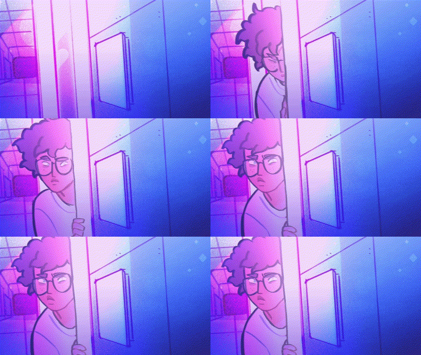
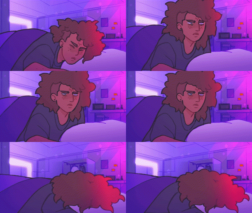


Indigo is a sci-fi indie animated series created by kuiiipermoon on YouTube. It is inspired by the colourful appearance of Steven Universe and Infinity Train with alien and space themes. I like the soft, pencil like look of the lines and how the colour of the lines is affected by the lighting. The backgrounds are quite similar looking to the artwork and the colouring on them follows the shape of the area rather than the lines so they poke out of the corners sometimes. I also really like the lens flare like look of the small stars on the screen. It is animated at a lower frame rate which I think compliments the pencil look of the characters well as it makes it look hand drawn. Additionally, I really like the way the movements look with the low frame rate as you can see the process of them moving and the jittery look adds personality. I also included some of their storyboarding thumbnails from an episode and although they are simple you can tell what the shots are well. The whole animation is made by just the one person and an episode comes out every month or so at a few minutes long - so I think this style matches well with my timeframe I have for my FMP. Additionally, the series so far has only taken place in the one indoor location and bedroom similar to where my animation will take place, so the style matches my ideas even more. For sound design, the characters don't have voice actors but are shown talking through different toned digital effects. I haven't thought about the sounds in my animation yet but watching the animations gives me the idea to experiment with it.
For my artwork, this research makes me lean towards having a lower frame rate for both managing my time and the look of the animation. I am also a big fan of the simple pencil like lines that I think add to the low frame rate nicely. Seeing all the different ways artists do their line work makes me want to experiment with different brushes and styles when I start my animating. I have also realised when looking at animation that I will need sound on mine and watching Indigo has got me to think about if there will be any dialogue, music and sound effects in my animation and is something new to experiment with.
Habromania


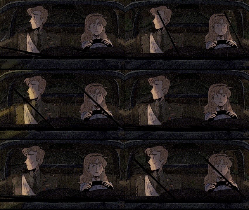

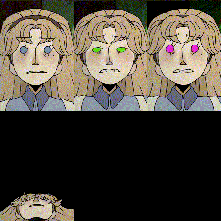
3
Initial Designs
Before I began my design sketches, I created some mood boards with additional visual influences in them for both of my characters, monsters and the environment to help inspire my initial designs further. For my sketches, I started by just getting a bunch of ideas out very messily before going in and developing some of the designs more clearly and spread out. I landed on a few designs for each character and monster as well a making an overhead room plan for the protagonists house. I next plan to make references of the characters designs that I choose and make some illustrations and clearer plans of the environment.


Here are my pencil sketches. I mainly focused on character clothing and hair and how that communicates the differences between the two girls before making a monster look that reflects her starting design. For the room, I made some overhead plans while thinking about the kind of clutter that would be in the room as well as where the character would go while in there and how that could affect shot composition. My main influences from my research were trying out different stylised looks inspired by the variety of different artists and animators, the clothing inspired by Libby Frame, the long weird look of Dana Terrace's monsters and using silhouettes to start my designs similar to Loan Le Hoang.


Fortnightly Evaluation:
Week Four
It is currently the end of week four of my project with the date being 14/3/25. I plan to evaluate on my time management, work quality and how my work compares to my project proposal so far. These past two weeks, I have completed research on advertising, consumerism, horror, environments, characters, monsters and animation styles as well as making my animation plan and starting my initial designs.
Time Management
Currently, I am running ahead of schedule since I have completed my project proposal, contextual research, animation plan, visual research and my initial designs. I did rearrange my work order compared to my timetable since I wrote my animation's concept in the middle of my research whereas I originally intended to complete it next week along with my initial designs. I am glad to be running ahead of schedule even if only a little since it gives me more time to complete my animation later if I need it.
Work Quality
Although I am working quicker, I think that my work quality is good. I asked my tutor to check my websites progress so far and have been talking with my friends about each others FMP and I have received positive responses so far. I am happy with my research so far and am excited to start my design section of my work while aiming to keep my research and what I liked from it in mind while doing so.
Project Proposal Comparison
In my project proposal, I stated that I needed to do as much research as I possibly could and I think I have done a good varied amount. I looked at primary and secondary sources as well as branching out from just looking at games and series. Compared to my previous projects, I have done lots more research which I hope will be an improvement on my feedback from previous projects. I have also been able to refine my area of interest that I initially proposed through this research.
Overall, I am happy with my progress so far and my projection of progress. According to my project schedule, I am dedicating the next two weeks to refining my designs, creating character and environment concept art and beginning to experiment with some different techniques before starting my storyboards and animation after my next evaluation.
Concept Art:
Characters
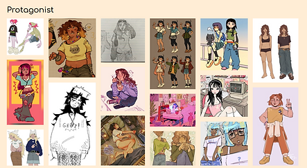
I began by designing my protagonist in her main outfit, settling on a simple design with her hair up and casual clothes. The style of drawing I settled on for my characters is inspired by my research, specifically from Indigo as I think the simplistic design will be helpful to animate and the simple facial features should be helpful when it comes to conveying emotions and drawing at different angles. As for her design specifically, I took inspiration from both character designers I researched. I liked the everyday look of Loan Le Hoang's characters and the outfits and messy hairstyles of Libby Frame's. I tested some different colour schemes of more cool to warm colours and settled on the right hand design with a mix of warm blues and reds. I then made some edits by making the shirt tan, adding some stains and changing the line art to a slightly redder colour as well as adding a version with headphones. I want her to try on some different outfits during the animation but will design them during my storyboarding using this as a base. I also made a more detailed sticker like image by adding more shading. I did this to show another pose in order to convey her personality of being obsessive and introverted. I plan to do this for my other character as well.


For my influencer character, I created her design of big layered hair, flowy clothing and accessories. I wanted her design to reflect the protagonist in ways so the outfits area similar shape with the shorts and strap tops and with accessories in the same places except hers is a more done up version, representing how she is an idyllic person and how she is in the public view I tested some different colours but settled on the blue outfit. Her clothing is inspired by Libby Frame's artwork from my research as I wanted her to have a done up but also slightly casual look which combines both the stage outfits and the practice ones from Peach Riot. The first edits I made were making the lines bluer and the jewellery gold as well as making the facial features larger. I then realised that I hadn't been thinking about how the design will reflect the monster elements so I made the overall colours bluer, made her eyes more purple, changed the jewellery to be silver and purple, removed the bow and made the necklace more eye shaped. I also added heels to the shoes as they looked too curved and not a shoe shape. I made these edits whilst designing my monster which will appear in the next section where I will explain why and compare them. Finally, I made the shaded sticker similar to my protagonists to convey character and show more poses.


I began designing the monster character with a silhouette which is something I wanted to attempt after researching Loan Le Hoang's artwork. I took inspiration from my initial designs hand and different shapes on the head. I tested with some purple all over but in my end design - which I drew in the same way as the characters - I instead made the ends pure black and the body a dark purple. To make the design reflect the monsters I like from my research, I kept it with a humanoid shape similar to Dana Terrace's but added differences such as the extra arm joints and long limbs. Below, I made quick notes on how the two designs compare. Firstly, the curled tentacles correlate to both the layered sticking out hair as well as how her top and socks flow outwards to match the shapes of the waist and feet. Additionally, the placement of the eyes matches where the human look has her regular eyes, mole, bracelet and eye necklace. The monster design is also taller than her as I want it to look more imposing and reflect how she is putting on a face to seem more relatable and approachable. The eyes - which I chose to be a motif based on the visual elements of eyes and weird angles I liked from Ava Groves Webster's artwork - also have a blurred glow on them to bring more focus to them. Next, I want to create an illustration that displays both of these designs in an interesting way and as a united character so I will experiment with some ways to do this and different compositions.


For my illustration, I began by making a mood board of artworks I liked that fit the theme of my characters. I was inspired by the following artwork by Searrach Dubh. I liked the shattered appearance of the left image displaying both sides of the character and the coloured pencil half-coloured style of the central. I combined these elements to make my portrait on the right which displays both character designs. I chose to draw this in a more detailed style as I do not need to focus on how easy it will be to animate but still tried to stay true to my original designs. I made this by starting with a full sketch of the human version before drawing in the dividing lines to add the second drawing based on the shapes of the previous. I enjoyed making this as it lets me visualise how the designs are connected more and was a fun change to draw in a different medium than I usually do.


Concept Art:
Backgrounds and Experimentation
For my setting artwork, I want to make some standard drawings of what the room will look like but also want to experiment with some other mediums. Initially, I was thinking of making some paintings but when I was creating my setting mood boards I found some small cardboard models of rooms which inspired to create my own. I found these matched the things I liked about the artwork of rooms such as the clutter, lived in look and since they are 3D I can display it at multiple interesting angles which is something I wanted to include in my animation. Below are some examples of those models I found. The examples mostly use cardboard, card and paper but I found that I didn't have much cardboard that was thin enough so went to get some more materials to try. I want my model to be made mainly from recycled scrap materials so it may not look exactly like how it will be in the animation and my drawings but can be an interesting starting point before I make those. The materials I have to start with are cardboard, balsa wood, fabrics, stuffing, foam, yarn, paper, paint, stickers and some small decorative trinkets like tiny bottles. The model will be based off of my overhead view sketches from my initial designs.


To start, I created a simple sketch of the room from a different angle than above based on the materials and fabric that I had available. It was also inspired by the cluttered lived in appearance that I loved from Savanna Judd's and Mousho's artwork with lots of layers in the room and height. I will also use this as reference for my animation but maybe with a change in colours and patterns so that it appears more uniform with whatever lighting I use in the animation. This is also based on the view form my overhead angle initial sketches. Next, I created a cardboard base with painted walls recycled from a delivery box.


I didn't like the texture the wet paint caused on the walls of the box so I replaced the walls and skirting with thin sheets of craft foam before painting the floor as I preferred the texture there. I realised after I should have painted the floor before adding the skirting as it got a bit messy but I solved this by placing furniture in front of those parts later. Next, I trimmed and painted my balsa wood a darker brown to make shelves and a bed frame. While this paint dried, I tried sewing some pillows but after attempting it found my sewing isn't that good so I switched to sealing the sides with hot glue before stuffing.

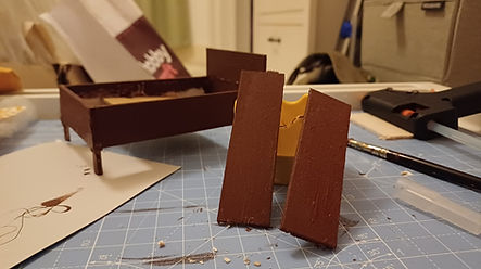
Next, I assembled my bed with the pillows and some fabric cutoffs as the sheets and falling blanket as well as using a block of stuffing as the mattress. I also used the fabric to created a frilled carpet that matched the blue pillow. Then, I printed some random posters and photos from media I like to go on the walls and also appear as albums on the shelf. For the shelf I also created a flower pot from a necklace chain bottle and some coloured yarn. Finally, I made a star garland from yarn, paper and silver star stickers which I threaded through the wall with a sewing needle.


The next set of furniture I made was a desk and a chair done in the same technique as the bed and shelves as well as some cardboard boxes, a bin and a noticeboard made of cardboard and foam. I also made another pillow to go on top out of the green fabric that I swapped out the tartan fabric for. After gluing these in pace I added some more images to the walls and notice board as well as finding some small, unused objects in my room to decorate with such as single earrings, beads, dice, controller grips and pen nibs. I also made the red slippers my protagonist has out of painted foam.

While I tried to stay true to my sketches and what I had in mind, I made some swaps in this scene to accommodate my skill level and materials such as making a small laptop rather than the desktop I wanted and the shape of the desk chair. Overall, I really enjoyed making this model as it was a change from the kind of art I usually make and allowed opportunities to think creatively about what different materials and random trinkets could be in the scene. While my furniture and crafting is a bit messy with the hot glue spilling out and some broken legs, I think I did pretty well for my first time making a diorama and am happy with the end result. Since I couldn't make all the walls of the room for the visibility of the model, I missed the wardrobe and window sides of the room but have a good idea in my mind and through my overhead view of what these spaces will look like in my animation. I plan to use the model as a reference for my animation but might change some colour and tones so they appear more united in the end result.
Fortnightly Evaluation:
Week Six
It is currently the end of week six of my project with the date at 28/3/25. These past two weeks, I have made my design references for all of my characters, made an illustration experimenting with traditional mediums and created my small reference model of my characters room. I am going to evaluate on the same points I did previously.
Time Management
I am still ahead of schedule since I have finished the concept art and medium experimentation that I have made but I may go back and create some more later to break up the animation so I can stay engaged with it. I am still glad to be ahead of schedule as it gives me more time to make my animation so that I am more likely to finish. I will hopefully take the next week to do my storyboarding as I gave myself a weeks worth of days but split across two weeks before, so that I am fully ready to animate for half term the week after.
Work Quality
I am happy with my designs so far and made sure to go back and edit them when I had new ideas. I have received positive feedback from my friends doing this course about where I am at on my timeline and how they like my designs. I tried to keep my research in mind when making these designs as I previously stated I would. I did receive some peer feedback to maybe experiment with some more poses for my designs to help convey character, so when I have my storyboards I may take some of the shots and redraw them as detailed concept pieces to match this.
Project Proposal Comparison
In my project proposal, I mentioned how I wanted to create concept art and experiment with different mediums. I think I have achieved this as my concept art comes from my character design references and illustration and the experimentation, from using the coloured pencils and making the physical model. I would like to make some more artwork later on though both after and during my storyboarding and some animating to break up doing the same task for so many weeks and to work on my feedback of looking at poses.
Overall, I am happy with my progress as of now and my timeline. According to my schedule and current work speed, my next two weeks are going to be spent storyboarding and beginning my animation but I may also do some more concept artwork but if not in the next two weeks then I will start after my next evaluation.
Audience and Storyboarding
Before I begin looking at the plot of my animation, I wanted to evaluate my audience in more depth. As previously mentioned, my research led me to my focus of how advertising often targets young women on their insecurities, appearance and by making their life appear less glamorous than an influencers and how this leads to overconsumption. Based on this, my demographic is young women and this is important to me as I fit into this group and have seen the negative impact social media and pressures to be a certain way can affect people. I want to keep this group in mind as I create my more detailed plot explanation and storyboards so that I use the designs I've created to convey these ideas.
For my story, I began with a more detailed explanation of my animations plot with a focus on the overall story, narrative, the camera shots and focus and the sound effects that I will need in each part. I split my animation into five separate scenes as shown below. I want my animation to convey the message that I was inspired by from my contextual research that the advertising and beauty industries can do a lot of harm to women's self esteem and mental health due to the pushing of trends and the constantly changing idea of a perfect woman. After revaluating my audience, I use the monster as a representation of how the protagonist feels she has even less control that she had before and how the ideas of perfection and beauty that she is being fed online are doing more harm than good rather than my initial idea of it just being creepy. It is something she is imagining as a result of the influences around her and how they make have heavy expectations of herself.

Now that I have my plot and ideas of what I want each scene to look like, I can start my storyboarding to visualise my scenes and have a base for my animation. I am mostly sure that I want to animate in frame by frame 2D as that is what my research revolved around but my storyboard can help me decide what would be most suited to my project as well as how I plan to test out different animating software afterwards.

1.

2.

3.

4.

5.

I have created some rough storyboards for each scene and included test and arrows to convey the movements that will happen in each as well as signalling when it is a montage scene, especially in scene 3. I included shots with a variety of angles and perspectives such as the first shot which is completely overhead and some of the scenes at the end where the perspective is slightly distorted on her face which is something I wanted to explore from my research into backgrounds so. Additionally, I also made simple designs for the hallway and front door of where she lives as some of the shots involve her leaving the room. I am happy with my storyboards and plot and have it pretty clear in my mind what I want to do and how my animation will work and look. Now I feel ready to animate and will start by deciding what program I want to make it in.
Animating
When choosing where to animate, I started comparing programs I could use based on how convenient and accessible they are for me to use and how effective they are for the animation I want to do:


3DS Max:
This is a 3D animating platform that I originally thought of using since I know the program well and can use it at home and college so I have more time to animate. Although now I have more of an idea about what I want to animate, I want to make it in 2D instead so this program is definitely not the one that I want to use for this project.
Procreate:
This is a Bitmap digital art program for mobile devices that has some animating capabilities. I am familiar with this program and since it is on my iPad, I can use it anywhere to maximise my animating time. Although, after testing out some animation its capabilities are very limited with there only being one drawing layer on each frame so I need something with more options.
Krita:
This is a free 2D illustration program with the option for an animating workspace. I am familiar with the program for illustration but did a quick test of the animation options and enjoyed them. I can use Krita at home and college and the animation capabilities are a lot better than procreate's so it is a top choice for me at the moment.
Adobe:
I mainly looked at Adobe Animate here and while I have heard that it is a good program, I do not have access to it outside of college so I will not have as many opportunities to create my animation. I also do not have as much experience with Adobe software than others because I can't practice at home so I may struggle with the controls here more.
Based on the programs that I have looked at, I have decided that Krita is my favourite of them all. I am familiar with illustrating on this program and after setting up the animation workspace it looks understandable and has similar controls to platforms I have done 3D animation on before so I think I am ready to begin animating. My plan is to draw a sketch / storyboard style for my whole animation first, then follow with clearer and crisper lines, then adding colour and finally adding any lighting, shadows and any other effects I want to use. After animating I will create the sound to go over top and then I will have the final product.

My first step was setting up my animation workspace. I made my canvas HD at 1920 x 1080 pixels with a resolution of 300 PPI as I had seen recommended. Once I had my canvas, I added the dockers - the tools that appear directly on my screen - of the animation timeline, layers, onion skinning, advanced colour selector and the brush library. I rearranged my screen to the following layout and found this was a good shape that framed the canvas well so I can see the whole thing. Next, I went through the brush library to find one I liked for my first layer of animating and set my animation to 12fps to start.


I began animating and made separate layers for the still and moving objects in each scene - showing the still in blue and moving in black. I changed my frame rate to 10fps instead since I reflected on my research and how I wanted a low frame rate animation and was finding some of the movements at 12 too fast. The overall style of animation I am going for as my end result is inspired by my research into Indigo and Habromania. I am taking influences from the previously mentioned low frame rate as well as the cartoonish style and when I reach doing detailed line work I will experiment with textures. The pictures above are from the completion of the first scene where I was learning how to animate in the program. I got a lot of good use out of the duplicate frame, onion skinning and layer movement tools at this point since it allowed me to adjust easily where I needed. I am happy with my choice of Krita for my software as it is very helpful to have the full range of tools that I would still get illustrating which I haven't experienced in other free programs I have used for animation before.
When I come to animate the back half of the second scene, I realised that I hadn't created the new outfit that the protagonist wears as she starts to feel better about herself. I wanted to keep the casualness of her original outfit but make it something that you would be more likely to go out in. To do this I kept the necked shirt but made it more intentional looking and switched the shorts to jeans making sure they're still loose and comfy. Since she isn't actually leaving the house, she still has her slippers and hair tie but I made two versions, one where she keeps her hair down and one where she puts it in a low ponytail with the hair tie. Furthermore, I wanted to keep the same warm toned colours but made them brighter to show her happiness at this point. I am leaning towards starting with the hair down look due to the scene where she brushes out her hair with the new products but as she gets more stressed later she can have the ponytail before going back to her original bun.

At this point, I found myself wanting to make some audio to make sure the animation syncs well with it in the early stages where I can edit frame more easily. I am still on the fence about having music or not so I will still make that choice after finishing my full sketch animation. For now, I have been adding and syncing the sound effects that will be in the scene as I finish each one. To do this I have used the website Soundtrap due to its sound library to make a range of sounds such as boxes opening and the shower running. I have currently finished the sketches for my first two scenes and was able to move them around with ease so the audio flowed smoother. Furthermore, finishing the second scene I am happy with the protagonists new appearance as it adds more meaning to the scene, showing how at this time she is feeling more organised and happy.


Fortnightly Evaluation:
Week Eight and Holidays
Currently it is the end of week eight of my project with the date being 25/2/24. I have had both the holidays and two weeks in college where I have completed my narrative overview, storyboards, some more concept art, chosen an animation software and began my animation in its sketch stages.
Time Management
Since I have been on top of my schedule, I mostly took a break during my time off but in the second week I took the time to finish my storyboards and begin animating and in that time was able to finish the first and half of the second scene based on my storyboards in the sketch layer. Since being back to college this past week, I began by organising my work onto my website, more animating and I have started making some additional concept art but plan to put those images later on my page. Reflecting on my timetable, I am happy with where I am at and am still slightly ahead as I finished my storyboards before this week.
Work Quality
While I have not got that far into my animating yet, I am happy with the progress I am making and am enjoying making the artwork. The sketch animation is not the best quality but it doesn't have to be as it is just a guideline for the defined linework that will come later. The sketching is also the part that takes the longest due to it being the first iteration of my ideas. I also think that it will be better once I create and add in the audio track so that the scenes feel more lively. I have started doing some additional concept art based on my later storyboards when I am not animating and am enjoying it so far but will display them all later on my website.
Project Proposal Comparison
In my proposal, I stated that for my final piece I wanted to create a short animation with a primarily digital approach which is what I have stuck to. Thanks to my research and designs I have been able to decide on how my animation is being made and that is my 2D frame by frame approach. I wanted the animation to reflect on my themes of online influences and advertising leading to overconsumption and negative emotions which is what my project has remained about with my research allowing me to make the area of focus even more specific.
I am enjoying my work so far and if I maintain the pace I am working at, it should work out well with my timetable and due date. My next two weeks will be focused on animating and I hope by the end of them that my sketch layer and majority if not all majority of my line layer will be done, ready to add sound and colour the weeks after.
Animating
The third scene of the animation is a montage of the protagonist buying and receiving products, while getting increasingly more agitated and the scene more fast paced with the creepy eyes appearing. The main section of this scene wasn't as difficult to animate as I could reuse a lot of the backgrounds and only had to make some edits in the character's appearance - such as her hair going back up and clothes switching back - and demeanour as the scene went on to show her increasing anxiety. I wanted the audio for this part to get increasingly louder and more stressful with sounds such as the phone going off, the door ringing, boxes opening and the introduction of some creepy whispers that get louder and louder. This continues until the end where she stops on the floor to breathe and debates cancelling her subscription but then orders the final package.


While animating the next two scenes, I also needed to come up with a title for my animation and make the title screen for the end result. I came up with the names 'perception/perceive' and 'pressure' as those are some of the main themes in my narrative. I ultimately decided on 'perception' as my title and created a small animation on a separate Krita file where the text wiggles for the title screen. It starts dark and the word perception comes on the screen followed by a blinking eye and my name. I will add this to my animation at the very end when I have all the parts and can edit them together. I also plan to have the same static sound that is in the background of lots of the scenes to be on the title page.

The fourth and fifth scenes followed the same process as the previous ones with the rest of the narrative playing out in the same sketch look. For the animation overall I made a few edits to my storyboards when it actually came to doing it such as adding and removing some scenes or changing the angles and location in the room. For example, I ended up switching out most of the scenes at the computer for looking at her phone instead. Most of the added shots were focused on displaying her expressions and emotions in the story, such as the one of her holding her phone above her head in the third scene. Something I struggle with when drawing is making sure the character looks consistent throughout different shots, so I also went back and made edits to some of the earlier scenes to make sure the protagonist had the same facial structure and features throughout. Now I am finished with the first layer, I next have to create my final audio track - potentially including music - and make sure it syncs with the animation.


My final step of my sketch stage was to finalise my audio for the scene. I ended up not using any music in the end but instead used lots of sound effects to create an eerie mood when needed. I chose not to have music to make the story feel more personal as if you are there with the protagonist in real life rather than watching something from the outside. I made sure to add static sounds throughout still, which adds ambience and reflects how her mind is clouded. I made sure all the audio was in sync with the visuals at this stage and moved around any scenes to better fit the sounds. Now that the audio is finished, I can move onto my line layer.


For my lines, I began by selecting a brush to use. Something I wanted to take from my research was using a textured brush for the lines to add personality as seen in some of the animation I looked into. Therefore I experimented with some different fuzzy and pencil like brushes before deciding on the second one along at a slightly smaller size than my sketches. I began by doing the lines on all of my backgrounds first in order to have a base for the characters and since lots of them are the same or very similar, I was able to copy and adjust them quickly and easily. Additionally, I used shape tools - mostly the line and quadrilateral - lots for the backgrounds as they contain mostly inorganic objects and furniture and drawing the lines by hand often made them look too shaky in places.

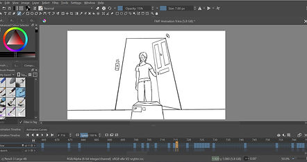
When it came to the movement layer, I took the same approach as the lines with the same brush but adding more frames in certain places where the animation was clunkier in my first layer to make it as smooth as other parts. I was debating adding some slight line boil to the characters which is something I have seen in lots of short stylised frame by frame animations but I found I preferred how it looked without it as well as it being less time consuming to animate. I did make sure to add some small movements like blinks and breaths to still give the characters life when they are mostly still as that was my main intent when deciding how to make my lines. Something I noticed when watching back the full sketch was that the character didn't look fully the same between scenes, specifically in the face and eye shape. This is something I have always struggled with when drawing characters so to fix the issue I chose the shape I liked most and was most used in the shots. I then compared it to my character art for her and adjusted the shapes when adding in my lines to create more continuity in her appearance. This issue made me reflect on what I did during my designing stage and I think i could have solved this problem earlier by putting more time into these designs by making references at multiple angles and expressions. I have also left the lines overlapping from the backgrounds at the moment as I am not 100% sure of the way I will colour and on how many layers I will use. At this point I have lined scenes one to three in movement and all of the scenes backgrounds and am projected to finish the lines early next week.
Additional Illustrations
As I stated before starting my animation, I received some feedback from my peers about creating some more artwork of my story with a focus on poses and expressions. I enjoyed using the bright coloured pencils to create the illustration of the influencer and the monster so I employed this same technique to make two more pieces.


The first one I made was inspired by this shot from Studio Heartbreak’s trailer for their animated short “The Lovers” - a thriller about a seafood chef and a siren set in a fantasy Philippines. I liked the framing of the character in the centre of the eyes and the difference in their sizes. I thought this well represented the pressure the protagonist feels to be something big like the influencer is. The influencer has a neutral expression and no real pose as you can only see half the face but the protagonist is seen standing over a dark box similar to one of the shots in scene five. I enjoyed showing this different angle in still form and it was definitely more interesting to draw the emotions on her face instead of just neutral. I did struggle with the protagonist's dark hair for this drawing though and am not fully happy with the result, I had this in mind as I wanted to make another drawing focused on her and this time I would test some combinations of colours before going straight into it. For the second piece, I made a portrait of the protagonist grabbing her face. I started by finding hair colours and focused on the reddish undertones of her dark hair because all the other colours would be so bright and I wanted all of them to match. I later decided to add the eyes in the style of the monster looking at her to again show she feels pressure and expectations on her. I wanted her face to capture her stress as she is pulling on her skin and hiding parts of her away. I enjoyed making these illustrations and it was nice to break up the long sections of animating with some more detailed drawings.
I am now going to move away from illustration to fully focus on my animation now that the sketching and audio is done. My next focus for animating is to get the solid lines, colour and lighting done by the middle of my final. Doing these drawings has been interesting experimentation and has helped me think more about what colours I might use and how they work together in my final animation.
Fortnightly Evaluation:
Week Ten
It is now 9/5/25 and the end of week ten of my project. Over these past two weeks I have been working on my animation, audio, title scene and additional illustrations.
Time Management
At this point I have been mainly working on my final piece so I wanted to make an even more in
depth timetable of my work on my phone for when each job in the process has to be completed by.
I made this at the start of the month and I am running ahead of this schedule at the moment as I
am on my line already so I will hopefully be finished with that in the next few days. Making this extra
schedule has helped me stay on top of my work as well as another strategy I have been using of
setting timers where I must do that amount of times work in a day. I am happy with where I am and
if I don't run into too many issues will hopefully be finished soon.
Work Quality
Now that I have finished my sketch animation, I am on the less time consuming parts of animating of the lines and colour which are my favourite steps to do when illustrating and I am interested to see how it will go in my animation. The quality of the sketch isn't the best but as I said in my last evaluation, it is just a guideline for my next steps so I am happy with it. Additionally, I found adding the audio really elevated the sketches as it made the scenes feel more alive. Finally, my additional coloured pencil drawings were interesting to make and an enjoyable break from animating to try a new style. I think I reflected on my peer feedback of using more poses and was able to implement that into my work.
Project Proposal Comparison
I am still making my final piece of a short animation and am progressing well with it. After this I will have my final overall evaluation where I will compare the proposal to my whole project and reflect on the final outcome of my evaluation.
The animating is going well so far and my working pace should have me finishing within both my first and more detailed timeframe. My final two weeks will be fully focused on finishing my animation before writing my final evaluation and adding any last touches to my website.

Animating
I started this final stage by finishing my movement lines and adding any zoom, extra frames and blur that I annotated onto my sketches but did not draw at that point. I think the textured and less sketched appearance of the lines has upped the quality of the animation so far but it doesn't feel that lively yet. I am hoping the addition of colour and the extra effects that aren't lined will make the final product more exciting and convey meaning. Once I saw the final lined animation I also worried that since it is quite a short animation that the narrative towards the end isn't conveyed in the best way. The way I thought to change it was by making it slower by reducing the frame rate but I found that would involve completely redoing the audio to sync with the new speed. So for now I have decided to leave it and see what happens when I start adding colour. Next I will start adding colour but I plan to go a scene at a time rather than backgrounds then movement as the characters have more bearing on the background in regard to light and shadows than they did with just lines.


When adding the colours I chose to go scene by scene starting with flat colours. Below is the first shot in the animation. I began by doing the flat colours for the still and background layer then did flats for the movement layer. Next, I made a separate layer above both colours but below the movement line to add any lighting and highlights. For this particular shot I chose to have the only light be bright blue from the phone screen that contrasts the dark room in order to draw attention to it. The last step was adding shadows. To do this I made another layer below the light set to multiply on a lower opacity. I then used the same colour to draw all the shadows in and due to the layer setup the shadow matches the colour below it and I am not made to draw each one in the matching colour. At this point I have completed this for the whole of scene one and will continue this for the rest of the animation.


When colouring scenes two and three I followed the same steps as previously with flats, the shading and lighting. These two scenes are the lead up to and the full montage so I wanted to use the lighting to reflect the characters mood. The curtains open at the start of the scene making all the colours bright to display her newfound confidence but they quickly end up back in shadow as she gets sucked into making purchases. I also used a different colouring method for the eyes throughout by using an airbrush in bright magenta around the purple eyes to make them look emissive before outlining the pupils in bright white. Due to the rooms getting darker and the eyes looking more like light sources, the eyes appear brighter as the scenes go on, further displaying how the online influences are affecting her. As I previously mentioned, I was worried that the narrative of my animation wasn't very clear. To see if this was the case, I asked some friends who do not know the context of my project to tell me what they think the story is about. Overall they understood what was happening but I received some feedback to make the scenes where there is text on the phone a bit longer since some people need longer to read it so that's what I did. Next, I will colour the final two scenes before adding my sound and making sure everything syncs for exporting.


The last two scenes colour went the same way as the previous but I wanted to focus on how the colour purple is a symbol for the monster and the outside influences affecting her. Once the colour was done I imported the audio to make sure the whole thing was in sync and did the same for the title credits. I exported both animations then edited them together in Microsoft clip champ before adjusting the audio volume and uploading to YouTube. Now my animation is up, I wanted to ask for some final feedback as I appreciated the responses when I was unsure about the pacing and how clear the animations narrative was. Unfortunately I realised after I had uploaded that some of the line work had overlapped and gone missing in ways I didn't intend, but it wasn't too noticeable against the whole product.


I created a survey asking for feedback on my final product:
- On a scale of not at all to definitely, how well do you think this ties into consumption?
- On a scale of not at all to definitely, how well do you think this ties into consumerism and advertising?
- Do you understand the story of my animation?
- What did you like about my animation?
- What do you think could be improved in my animation?
For the first two questions, I received 100% definitely on both which I am thankful for as the whole brief and my project revolves around these themes and I am glad they came across to the audience. My initial worries of an incoherent story were also soothed as the responses all explained how they understood the story. When asking what the audience liked about my animation, the main positive feedback was around the environment and the way lighting was used to convey her emotions, such as the room getting darker, lighter and darker again and the purples getting brighter. Another piece of positive feedback I liked was about the pacing and how it added to the narrative, once again helping with my worries about the narrative. In regard to improvements, the first piece of feedback I received was to add some more music to create suspense. Whilst I opted for no music I didn't make any samples and tests to see how it would pair with the animation so in the future if I am unsure about what decision to make I should try out the different things rather than just immediately committing. The other main piece of feedback was to add more detailed expressions and design to the monster and the character. For the monster I found the design ended up looking less detailed than I had hoped when actually in the animation as I think towards the end of the video I was more focused on finishing than adding all the details which I could have spent more time on. The same goes for the expressions where the specific feedback was making her look more fearful at the end. I think the simple design of the face especially the lack of separation between the eye's outline and pupil held me back when it came to expressions and to improve on this in the future I think I should make an expression sheet for my characters before going into animating. Overall, the final product was well received by its audience and all the feedback was constructive and helpful.
Final Design and Evaluation
Research
The brief for this project was to create a project surrounding the theme of consumption that includes a proposal, research, practical development and evaluations against the theme. In my project proposal, I stated how I wanted to research advertising, influencers, horror themes and visual pieces for my characters, monsters and backgrounds. Additionally, I wanted to use more primary sources than my previous projects like surveys and primary images. I began by researching advertising through a survey, museum and the things that show up from influencer marketing on my own social media. This research led me to looking further into consumerism and how all of these aspects lead to overconsumption with a focus on trends amongst young women. The research inspired my target demographic of young women and made a clearer focus for the narrative of my animation to revolve around influencers and overconsumption affecting the young female protagonist. The next section of contextual research was into different types of creatures in horror where I mainly explored fae and otherworldly creatures. This led to my initial idea of the influencer character being a shapechanger type which aligned with the fantasy elements in my project proposal. Throughout development the creature became more of a representation of how the protagonist feels perceived rather than being an actual monster, but the design elements still reflect how I wanted a fantasy feel. In regards to visual research, I looked into a variety of artists and primary sources starting with backgrounds. The environmental artists I researched made me want to include the busy appearance and distorted perspectives in my own artwork which I did so by including lots of angles in my animation although I would have liked to explore some more if my animation were longer. For the characters, the clothing of my peers and the artists I looked at inspired the casual and layered appearance of my protagonist as well as the put together but reflective of the protagonist's outfit of the influencer. For the monster, the artists I researched led me to creating a distorted but humanoid monster whose design reflects the influencers as a result of my researched idea of shapechangers. The research led me to creating a design that bridged the gap between stylised and gory although I think I could have explored some more approaches and would have liked to try out some other monster looks. Overall, my research helped me create a clearer idea of what I wanted from my final animation after my project proposal for the appearance, narrative and themes.
Design
My first designs came from my initial sketches of rooms and characters inspired by my research and additional ideas from mood boards and some notes. Thanks to the variety of visual research I had completed I already had some clear ideas in my mind about what I wanted the designs to look like so I didn’t do too many original sketches. Looking back, I wish I had explored some more ideas for what my characters might look like. While I am happy with the end result, I think it would have been beneficial to try out some other ideas too. I also created my animation plan after my contextual research which helped my ideas form an actual narrative, connecting both the horror and advertising. For the character design development, I made some simple digital drawings and received some peer feedback to add some more poses and expressions to convey character. From this feedback I made another digital drawing of both of the characters as well as taking inspiration from my initial mood boards to experiment with more detailed coloured pencil drawings. The model I made for my bedroom scene and these drawings were a nice challenge and change as I was using different mediums to digital which is something I wanted from my project proposal. For my final design, I used the model and character designs as references for different shots. Something I struggle with when redrawing characters is making sure they look the same throughout and I found when watching back my first iteration of the animation that the protagonists face looked different at the start and end. To fix this issue, I went back and referenced my character designs to make the face more similar in each shot. Doing this though made me realise how I should have put some more time into my character profiles to make this easier for me later on. I could have done this by including a whole body turnaround of each and expression sheets. I enjoyed drawing all the different angles and scenes for my animation and making sure that when backgrounds were repeated, the colour and mess were slightly different. When watching the whole animation back I was worried that the story didn’t make much sense since, so to see if the narrative could be understood I asked some friends who did not know the context of my project and what the story was before seeing it to give some feedback. Overall it was well received but it led me to making some of the scenes where there is text on the phone longer since it couldn't all be read at once. Once I had the final product, I made another survey where I also received helpful feedback which I will contribute to future projects. Reflecting on my project proposal, my goal was to make a short animation with a primarily digital development approach and some experimentation throughout which I think I accomplished. It was very helpful to have multiple things influence my design like my research, feedback, experimentation and development work. Overall, my development was very helpful to my final result as it complimented my research in helping me find the narrative and audience for my project.
On the whole, I enjoyed this project especially getting to spend more time on a theme and creating a whole product. If I were to do this again, I think I would spend some more time on the development stage as I found myself improvising on the appearances of things while animating such as facial expressions and perspectives. Although I am still happy with what I had done at this point as the experimentation was one of my favourite parts of the project.
Reference List:
Bhasin, H. (2020). History of Advertising: Definition and Complete Timeline. [online] Marketing91. Available at: https://www.marketing91.com/history-of-advertising/ History of advertising facts and milestones. Info on conspicuous consumption.
Collings, S. (2025). Habromania. [Video Game, Animation] Available at: https://www.instagram.com/symphony_sonata/ [Accessed 12 Mar. 2025].
Critical Role (2025). Morrigan. [online] Critical Role Wiki. Available at: https://criticalrole.fandom.com/wiki/Morrigan [Accessed 3 Mar. 2025]. Info on fae and Morrigan.
Dershutze (2025). Derschutze Website. [online] Derschutze. Available at: https://derschutze.com/?srsltid=AfmBOopK3NnFzHSW3MdeAK1BB-2coaaiW18dU5aeBtdhs8QUUeTlVELt [Accessed 4 Mar. 2025]. Info on what they sell, pricing and social media .
Dimension 20 - Misfits & Magic (2025). The Tadershecourt. [online] Fandom.com. Available at: https://dimension20.fandom.com/wiki/The_Tadershecourt [Accessed 4 Mar. 2025]. Info on Tadershecourt.
Dubh, S. (2024). SEVEN OF SWORDS. [Digital] Available at: https://www.inprnt.com/gallery/sanctus-ingenium/seven-of-swords/ [Accessed 26 Mar. 2025].
Frame, L. and Beach Bunny (2025). Tunnel Vision Album Cover. Spotify. Available at: https://open.spotify.com/album/2DVKqtyckfMyE6ypDePXjM [Accessed 11 Mar. 2025].
Frame, L. and Peach Riot (2025). All Artworks Used. [Digital] Available at: https://www.instagram.com/libbyframe/ [Accessed 11 Mar. 2025]. Peach Riot and other artwork.
Freesound (2012). Freesound. [online] Freesound.org. Available at: https://freesound.org/ Animation sfx.
Fresh (2021). Girl Clout. Available at: https://open.spotify.com/album/2xIJQK1drHR14ua2aiVeXP?highlight=spotify:track:2wgSiQXfOLE5K3xDNfhbNe Spotify screenshot - more like Fresh origin.
Groves Webster, A. (2024). All Artworks Used. [Digital] Available at: https://www.instagram.com/peachy.doodle/ [Accessed 11 Mar. 2025]. peachydoodle work.
Hayes, A. (2024). Consumerism Explained: Definition, Economic Impact, Pros & Cons. [online] Investopedia. Available at: https://www.investopedia.com/terms/c/consumerism.asp#toc-advantages-and-disadvantages-of-consumerism [Accessed 5 Mar. 2025]. Info on consumerism and consequences.
Ibarra Lugo, A. (2023). Morrigan and Mismag Tadershecourt Artwork. [Digital] Available at: https://www.instagram.com/p/CsIC82Ju3Cy/ [Accessed 3 Mar. 2025].
Judd, S. (2020). All Artworks Used and Quotes. [Animation, Paintings, Games] Available at: https://heartslob.com/ [Accessed 20 Feb. 2025].
kabiritservices (2024). The History of Advertisement | Old Vs New Advertising Trends. [online] Kabir IT Services Pvt. Ltd. Available at: https://kitss.tech/old-vs-new-advertising-trends/ Info on old vs new advertising techniques on initial research mindmap.
kuiipermoon (2025). Indigo. [Animation] Available at: https://www.youtube.com/@kuiiipermoon [Accessed 12 Mar. 2025].
Le Hoang, L. (2024). All Artworks Used. [Digital] Available at: https://www.artstation.com/loanlehoang [Accessed 11 Mar. 2025].
Lily, G. (2025). House Models. [Craft Cardboard] Available at: https://www.etsy.com/shop/LilyGregoireArt?fbclid=PAAab0HibjNGepsG086MEinBWJ-N1RB8siqdZOT__z75li6p7TUE37-bZKep4_aem_AQTzairF6Ly_jHUJHc-WN7JwWdAgmqpNxq5TQX8v6kMsd4nCl5MCFEReGfMXCElvujE&load_webview=1&bid=OYETz29OECR9OV0NB9hQLXka01kI [Accessed 21 Mar. 2025].
Lorenzo, H. (2022). How Younger Generations Conform to Fashion Trends. [online] Trinity Tripod. Available at: https://trinitytripod.com/opinion/how-younger-generations-conform-to-fashiontrends/.
Lovecraft, H.P. (2019). Supernatural Horror in Literature. S.L.: Lulu Com. Summary of themes from this book.
Maisto, G. (2022). Override. [Digital] Available at: https://www.behance.net/gallery/137245701/Override [Accessed 21 Feb. 2025].
Miholics, J. (2022). Anger as A Symptom. [Digital] Available at: https://www.instagram.com/p/CbV0ge9JDDL/?hl=en [Accessed 21 Feb. 2025].
Mousho (2021). All Artworks Used. [Digital] Available at: https://x.com/wasshoihot?lang=en [Accessed 20 Feb. 2025].
Ola (2024). Kissing Ribs. [Digital] Available at: https://www.instagram.com/ra3kiv/ [Accessed 21 Feb. 2025].
Pinto, R. (2012). Ricardo Pinto - Consuming Individuality. [online] Ricardo Pinto. Available at: https://www.ricardopinto.com/2012/03/05/consuming-individuality/ [Accessed 5 Mar. 2025]. Info on lack of individuality under consumerism.
Popmart (2024). About Libby Frame & Peach Riot. [online] Popmartworld.com. Available at: https://www.popmartworld.com/brand/peach-riot [Accessed 11 Mar. 2025].
Soundtrap (2025). Soundtrap. [online] Soundtrap. Available at: https://www.soundtrap.com/studio/GhO8lUn1Rc2MnOvwtyIqUw/ [Accessed 24 Apr. 2025]. Audio library and sound effects of final piece.
Spotify (2024). Spotify Screenshots. Spotify. Photo from ads manager and my Spotify ‘More like Fresh’.
Studio Heartbreak (2023). The Lovers Trailer. [2D Animation] Available at: https://youtu.be/tEs08eC0GJE?si=WmPM7KE128_bi06o [Accessed 23 Apr. 2025]. Screenshot from trailer and writing .
Taylor, S. (2015). The Problem with Wanting. [online] Psychology Today. Available at: https://www.psychologytoday.com/intl/blog/out-the-darkness/201507/the-problem-wanting Info on dissatisfaction.
Terrace, D. (2024). All Artworks Used. [Digital] Available at: https://www.tumblr.com/danaterrace [Accessed 11 Mar. 2025].
TikTok (2025). TikTok Screenshots. TikTok.
YouTube (2025). YouTube Ad and Channel Screenshots. YouTube. Screenshots from YouTube home page, Ginny Di video and D20 Shorts.